Answer the question
In order to leave comments, you need to log in
What font to use for development (phpstorm)
Hello. It was winxp + phpstorm - my eyes got used to the font. I switch to ubuntu, installed phpstorm, but the fonts are not the same. Looks like I'll have to get used to it again. What font is better to use initially and not miscalculate so that your eyes do not get tired later? In winxp there was a monospace, in ubuntu it is completely different.
Answer the question
In order to leave comments, you need to log in
Ubuntu 10.04
24" 1920x1080 - I love good code coverage.
Interface: Verdana / 11
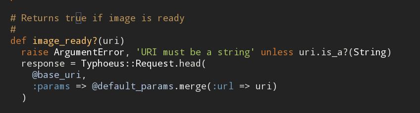
Code: DialogInput / 11
FreeMono is similar to the Courier you apparently had on Windows. DejaVu Sans Mono looks best under Ubuntu (and in general, monospaced sans-serif fonts are more convenient for reading code than serifs). But that's for me personally. There are also options in the form of Terminus or Consolas (you need to take it from Windows Vista / 7 or Office 2007-2010).
stumbled upon this one a year ago, haven't seen anything better since then
i.imgur.com/pl0mb.png
ubuntu mono, 18px
here due to java 18px = 14px in sublimetext3
i.e. in fact the font is small
phpstorm2017.1 (default white-gray color's scheme)
ubuntu16.10
1920x1080px
Is it possible to put a windows font in ubuntu? Small soft ones have released some of their Windows fonts “in the open”, monospace is not among them, is it?
www.sharpfonts.co.cc/ Installed
in due time under fontconfig in *bsd. All OK.
We go in Ubuntu in the appearance, go to the Fonts section.
Here are the anti-aliasing settings.
They can greatly change the appearance of the font and even ... its size :)
For example, full-subpixel produces a font ~ 10% smaller than "no anti-aliasing
under Windows I really like Consolas, but in ubuntu, because of a different anti-aliasing, it looks somewhat flawed and I didn’t bother much with similarity, so I settled on Droid Sans Mono. so far very good
I really like Monaco , but I'm not sure if it will look the same on Ubuntu as it does on MacOS.
I have the same story, though there are no complaints about the font of the code, but it’s hard to look at the interface so far.
Please write back when you find a suitable interface font
Anonymous Pro, for example. Although I like the default Ubuntu Monospace
In Linux Mint I use Fira Mono. It has fatter lines than DejaVu/Liberation Mono (which I use on Windows). Still, font rendering in a storm leaves much to be desired.
Didn't find what you were looking for?
Ask your questionAsk a Question
731 491 924 answers to any question