Answer the question
In order to leave comments, you need to log in
What are the similarities between the two designs?
I have been using the color picker from the site: https://colorpicker.me
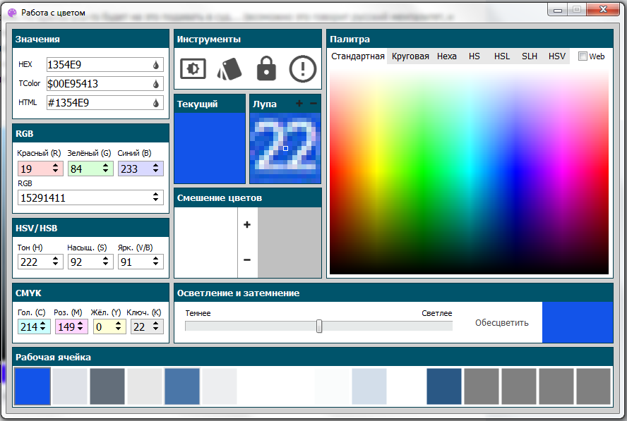
for 2 years . But recently (2 weeks ago) I decided to create my own website about flowers. There will be not only colorpicker, but also other useful services. The essence of the problem is that for 2 years I got used to the location of the blocks and information on the above site and now all the other pickers seem uncomfortable to me. When trying to draw the design of my picker, I come across the fact that it is either UNCONVENIENT or very similar. Here is a design that I consider to be something of a middle ground. Help determine if it is very similar to the one on the site? Perhaps there are a couple of things that can be changed to make the design unique? And if you still leave the design like this, can there be any claims from the author of that site?
Answer the question
In order to leave comments, you need to log in
Do not bother much with this, because. design is subject to patent rights. It is worth wondering if they come to you with a claim that there is a patent and your design is covered by this patent, but for this you simply do not copy the site.
The design is very similar. But it is unlikely that someone will sue for this .... (perhaps this is the Russian mentality, and Western people will treat this differently ...). By the way, is the font free or licensed?
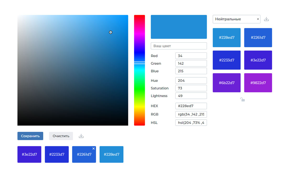
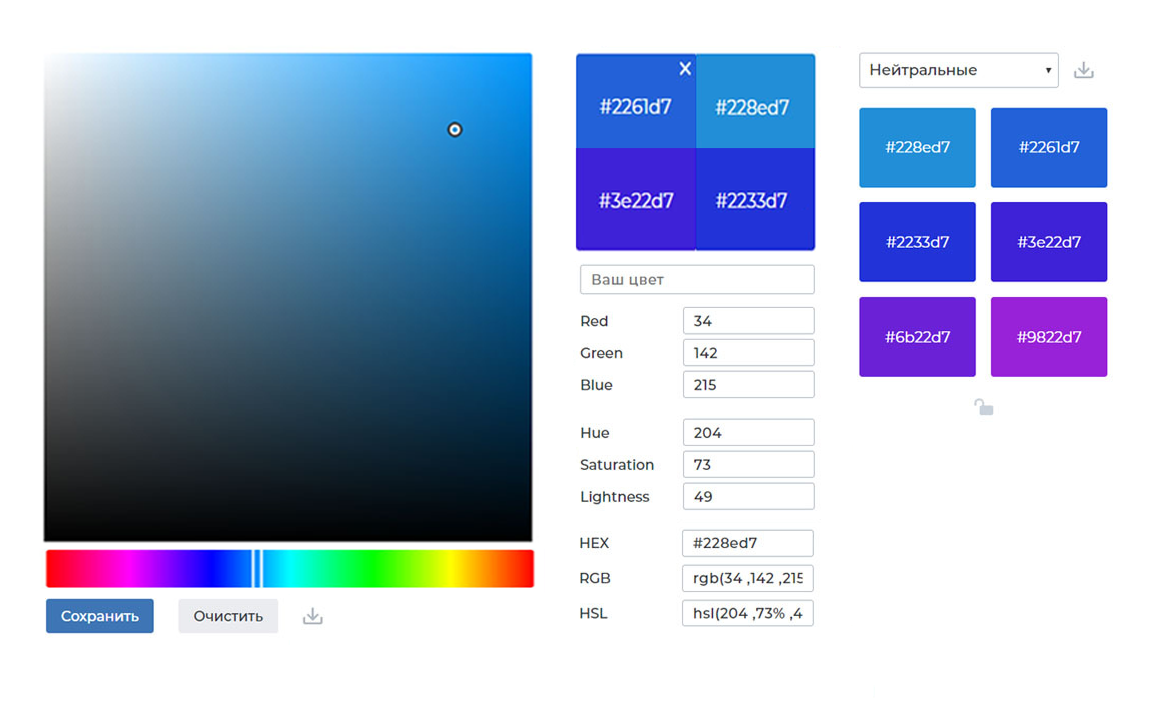
Make the picker area smaller, position the color gradient below it horizontally. Slightly spread blocks of RGB, HSL values and codes. (thin frames or distance between blocks in 2/3 of the line width. Make a frameless view-comparison of the latest colors instead of spaced icons below and a separate window with the current one at the top ...
Like that:
Didn't find what you were looking for?
Ask your questionAsk a Question
731 491 924 answers to any question