Answer the question
In order to leave comments, you need to log in
Answer the question
In order to leave comments, you need to log in
Medical research has proven that a dark screen image with negative lettering (I mean your topic) is only beneficial when working in semi-darkness. At night without light, for example.
In a lighted room - a light theme is preferable for eye health. Yes, and it is better to turn on the light.
I have migrated from VS Code to PHP Storm.
And he also faced the problem of visual discomfort. The reason was corrected by changing the font size and the spacing between letters and lines. Fortunately, the IDE given for these settings is quite rich.
A couple more tips:
Use a dark theme in a dark room. Because in the daytime there will be, on the contrary, a load on the eyes, instead of relaxation. If you still have a monitor that does not have high brightness, then this is very noticeable. Try to completely abandon the dark theme. And look at the sensations when working with light.
Another point that always bothered me when using the dark theme. During the day it is not so felt, but at night it is directly annoying. When you typeset, you have to jump from the editor to the browser and back. And there is always a change from dark to light. After an hour of work, the eyes feel tired from this.
Try to work either during the day or in good lighting. And switch to a light theme. You can try installing a blue filter. A very useful thing, although the color distorts at the same time. But if you are working from a layout, then this does not matter to you.
Eye health should be a priority in my opinion.
Most often the problem is in the fonts. Look for a font like Monaco Bold or Fira Code Medium
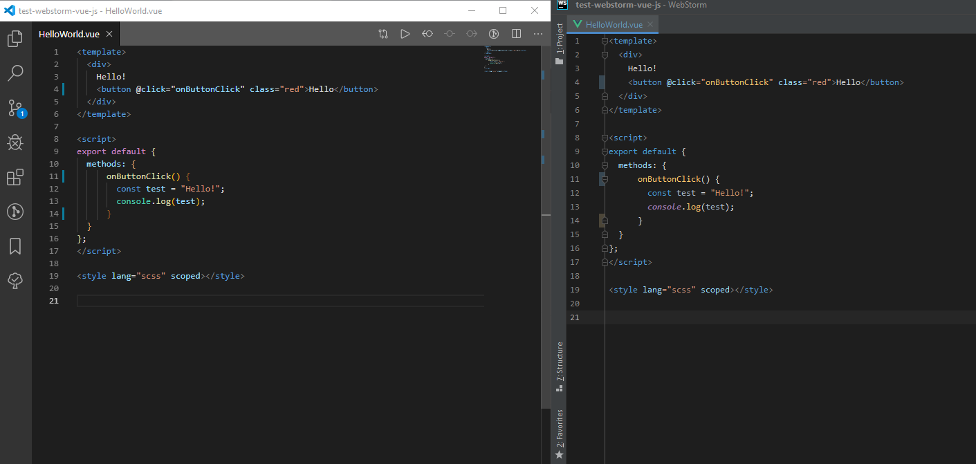
Not the same - in the editor on the left, the fonts are more contrasting ...
Didn't find what you were looking for?
Ask your questionAsk a Question
731 491 924 answers to any question