Answer the question
In order to leave comments, you need to log in
Website layout, design?
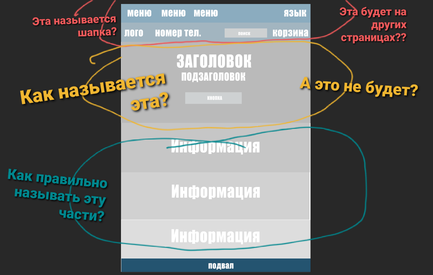
Look please! I'm just learning... I want to make such a website. The first main page of the online store.
It is right? Or not right?
And please answer the questions from the picture!
sorry for the stupid question
Answer the question
In order to leave comments, you need to log in
Hello, there is a lot of information on the Internet about your question.
For example: https://habr.com/en/post/273795/
and also on YouTube there are ready-made videos where they clearly show how to make a website design (in Sketch, Figma, Photoshop).
What is highlighted in red is the site header. It is also present on the inner pages.
What is highlighted in yellow is called the main banner. it all depends on whether this particular banner is needed on other pages.
What is highlighted in blue is the content. it can be different if an online store, it can be examples of goods, reviews, etc., etc. There are a lot of variations.
The basement or footer (footer) performs several important tasks at once. And depending on the design, it can be directed to some of them or all at once. In practice, it is used in 99% of cases on all pages.
It doesn't matter how the block is called - what matters is what is in it.
CTA, contacts, gallery, product cards, contact forms, banners, links, buttons, search, SEO-text.
Approximately all of this consists of IM, landing pages, etc. And in what place it will be placed, you decide based on the task.
Didn't find what you were looking for?
Ask your questionAsk a Question
731 491 924 answers to any question