Answer the question
In order to leave comments, you need to log in
Testing a 4K website layout without a 4K monitor?
Hello!
There was a question about the layout of the site in high resolutions. Quite a lot of people now use widescreen 4K monitors (3840 × 2160 like?), so there is a need to test the layout on such resolutions no less than on mobile ones. In this connection, the question is how to test the site layout in 4K without a 4K monitor using software tools? Will Chrome's built-in debugger work? Does a site built on the canonical bootstrap look like an unfortunate 1170px stripe or does the viewport scale the site to a readable size? Does the user of such monitors constantly have to scale sites? Maybe there is a more convenient service for testing layout in high resolutions?
Thank you.
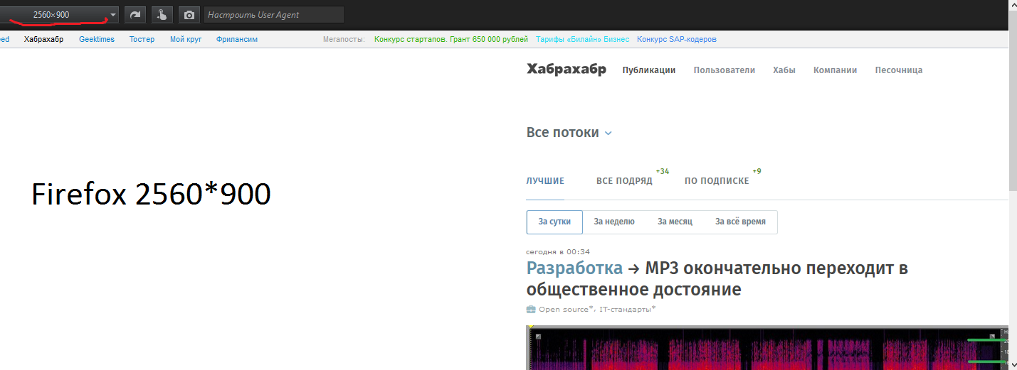
UPD: 1 I am attaching screenshots with testing habr in chrome and firefox. If you believe chrome, habr on 4k monitors is scaled around the edges to the entire monitor and all elements, respectively, too. If you believe firefox habr is centered and the top panel is infected with communism and flies to the left to the edge. Who to believe? Owners of 4k monitors with screenshots of habr on their monster device fullwindow - chrome browser are cast into the thread.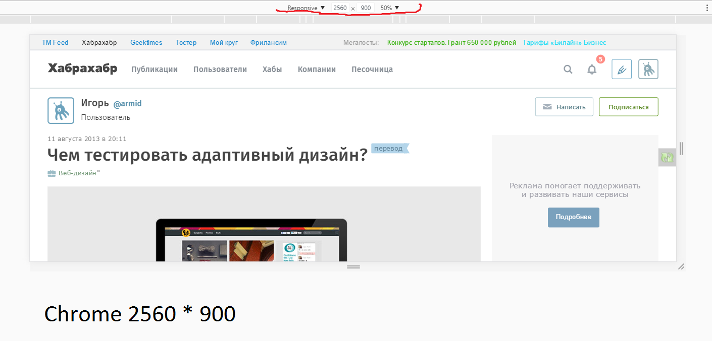
Answer the question
In order to leave comments, you need to log in
I don't know a single person who would use a 4k (and higher) monitor in native / full resolution, you have to look at the monitor through a telescope.
they are used in hidpi mode, in which the resolution is equivalent to fullhd. read only additionally about graphics optimization for hidpi.
In my stable chrome on an UltraHD (3840x2160) display on macOS, everything is drawn in the same way as on FullHD, only the text looks much nicer, for example:
And
here is the same window on a Full HD display:
In general, I advise you to buy an UltraHD monitor, modern GPUs built into the processor pull them without problems, not to mention normal GPUs, besides, a very good Dell P2415Q costs a little more than $ 500.
I just set the desired width in FF:
joxi.ru/Dr86O0DI4yEZk2
Just yesterday there was a need for such testing, the customer checked it on a huge Mac monitor. In general, I did not find any problems, everything, as I saw on my monitor, was also displayed by the customer.
I advise you not to make up for 4k, but rather to scale the content - so that it is displayed as 1920p with an increased adaptive size. Ultimately, the user wants convenience, not corruption.
1) You can’t test it in Firefox in any way, the adaptive layout debug is crooked, there is no scaling (you need to add a bug to the FF bugtracker along the way)
2) Do not confuse the physical screen size with CSS size (the latter can be found here screensiz.es or dpi.lv point dppx)
3) In Chrome, in adaptive layout mode, add your device and debug, there is scaling, so the size of the tested screen can be larger than the size of yours
4) Don't forget about https://www.w3schools.com/css/css_rwd_viewport.asp
5) Don't forget about vw, vh, vmin, vmax caniuse.com/#feat=viewport-units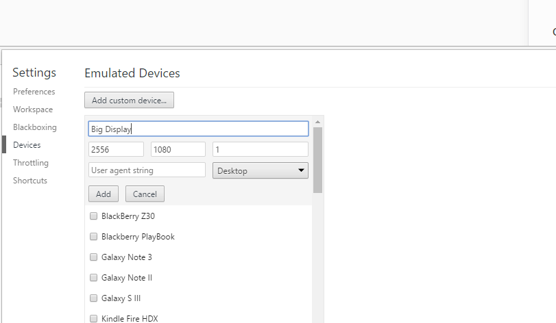
For me, the question is theoretical, but I usually set adaptability not only by the width of the grid columns, but also by the height in vh. Hypothetically, everything will look the same on all screens, since the proportions in resolution are the same, and both dimensions are given by the ratio. Chrome tools seem to confirm the theory.
P.S. There is also browserstack.com
Didn't find what you were looking for?
Ask your questionAsk a Question
731 491 924 answers to any question