Answer the question
In order to leave comments, you need to log in
Showing Navigation Bar in Bootstrap?
How to change default display on tablets and phones Navigation Bar in Bootstrap?
The problem is that on tablets and phones it is displayed like this: 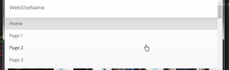
On a PC like this: 
I want it to be displayed on tablets the same way as on a PC. The default option is not acceptable at all.
The code:
<nav class="navbar navbar-default ">
  <div class="container-fluid">
    <div class="navbar-header">
      <a class="navbar-brand" href="#">WebSiteName</a>
    </div>
    <ul class="nav navbar-nav">
      <li class="active" .col-sm-3><a href="#">Home</a></li>
      <li .col-sm-3><a href="#">Page 1</a></li>
      <li .col-sm-3><a href="#">Page 2</a></li>
      <li .col-sm-3><a href="#">Page 3</a></li>
    </ul>
  </div>
</nav>Answer the question
In order to leave comments, you need to log in
Didn't find what you were looking for?
Ask your questionAsk a Question
731 491 924 answers to any question