Answer the question
In order to leave comments, you need to log in
Should text align to the bounding box in Figma?
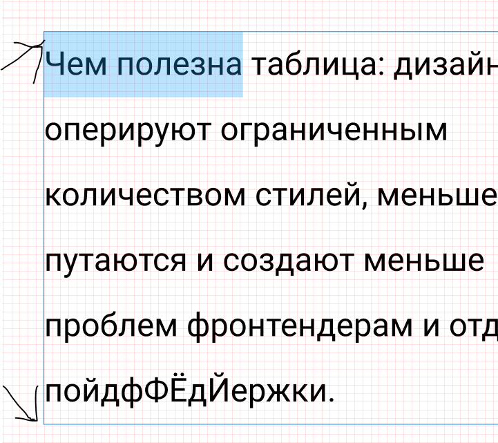
The screenshot shows that Figma automatically adds space above and below the text, depending on the line height.
The problem is that this creates unpredictability with vertical rhythm.
Different combinations of text and pictures can generate distances that were not intended
. How do you deal with this, mb is there any method?
after all, there are no fools in Figma, probably they did it for a reason)

Answer the question
In order to leave comments, you need to log in
In terms of layout, you need to focus on frames, as they are automatically generated based on line height, size, and font features.
The same frames determine the outer size of the element with text, and indents will be calculated from it in the future.
Didn't find what you were looking for?
Ask your questionAsk a Question
731 491 924 answers to any question