Answer the question
In order to leave comments, you need to log in
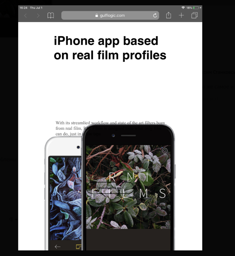
Responsive for iphone/ipad?
I don’t understand what I’m doing wrong, in the browser it shows that everything is in order, the layout works as it should, but if you try it all on an iphone or ipad, then everything goes somewhere, as if I didn’t do anything for that so that everything is smooth
Maybe I installed the wrong screen extensions? No idea
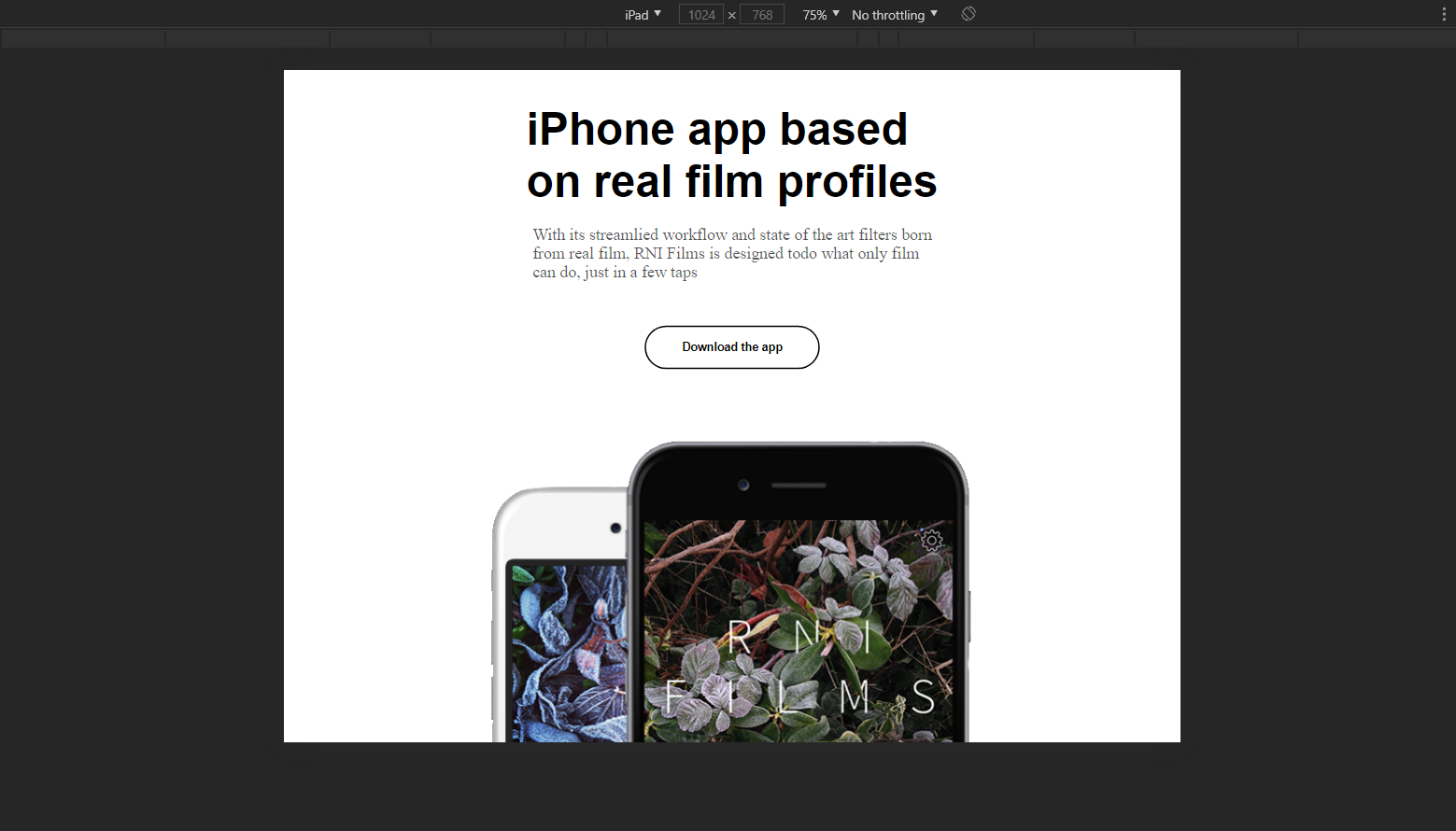
Visually what it looks like:
<!DOCTYPE html>
<html lang="ru">
<head>
    <meta charset="UTF-8">
    <meta http-equiv="X-UA-Compatible" content="IE=edge">
    <meta name="viewport" content="width=device-width, initial-scale=1.0">
    <title>Верстка моб. приложения</title>
    <link rel="stylesheet" href="css/style.css">
</head>
<body>
    <div class="container">
        <img src="img/phones.png" alt="">
        <h1>iPhone app based<br>
            on real film profiles</h1>

        <p>With its streamlied workflow and state of the art filters born<br>
            from real film, RNI Films is designed todo what only film<br>
            can do, just in a few taps</p>

        <button id="download"><span>Download the app</span></button>
    </div>
</body>
</html>* {
margin: 0;
padding: 0;
}
.container img {
position: absolute;
right: 5%;
bottom: 0;
}
.container h1 {
font-size: 51px;
font-family: helvetica;
position: absolute;
top: 28%;
left: 10%;
}
.container p {
font-size: 19px;
position: absolute;
top: 48%;
left: 10%;
color: rgba(0, 0, 0, 0.678);
}
.container button#download {
width: 200px;
height: 50px;
background: none;
border: 2px solid black;
border-radius: 25px 25px 25px 25px;
position: absolute;
top: 63%;
left: 10%;
font-weight: bold;
cursor: pointer;
}
@media screen and (max-width: 1200px) {
.container img {
position: absolute;
left: 50%;
margin-right: -50%;
transform: translate(-50%, 0%);
top: 350px;
}
.container p {
left: 50%;
margin-right: -50%;
transform: translate(-50%, 0%);
top: 25%;
}
.container button#download {
left: 50%;
margin-right: -50%;
transform: translate(-50%, 0%);
top: 40%;
}
.container h1 {
left: 50%;
margin-right: -50%;
transform: translate(-50%, 0%);
top: 5%;
}
}
@media screen and (max-width: 573px) {
.container img {
width: 90%;
height: auto;
}
}
@media screen and (max-width: 484px) {
.container p {
top: 18%;
}
.container img {
top: 330px;
}
.container button#download {
top: 35%;
}
}
@media screen and (width: 768px) {
.container p {
top: 20%;
}
.container button#download {
top: 30%;
}
}
@media screen and (width: 1024px) {
.container p {
top: 17%;
}
.container button#download {
top: 25%;
}
}
@media screen and (width: 1024px) and (height: 768px) {
.container p {
top: 24%;
}
.container button#download {
top: 40%;
}
}
@media screen and (width: 375px) and (height: 667px) {
.container h1 {
left: 60%;
}
.container p {
top: 24%;
}
.container button#download {
top: 70%;
}
}
@media screen and (width: 375px) and (height: 812px) {
.container p {
top: 40%;
}
.container button#download {
top: 60%;
}
}
@media screen and (max-width: 417px) {
.container p {
text-align: center;
font-size: 16px;
margin-left: 1px;
margin-right: -124px;
}
.container h1 {
text-align: center;
font-size: 31px;
}
}
@media screen and (max-width: 285px) {
.container p {
top: 25%;
}
.container img {
top: 380px;
}
.container button#download {
top: 42%;
}
}
@media screen and (min-width: 812px) {
.container p {
top: 40%;
}
.container button#download {
top: 70%;
}
}
@media screen and (min-width: 736px) {
.container p {
top: 40%;
}
.container button#download {
top: 70%;
}
}
@media screen and (min-width: 667px) {
.container p {
top: 40%;
}
.container button#download {
top: 70%;
}
}
@media screen and (min-width: 568px) {
.container p {
top: 43%;
}
.container button#download {
top: 70%;
}
}
@media screen and (min-width: 765px) and (min-height: 1023px) {
.container p {
top: 20%;
}
.container button#download {
top: 33%;
}
}
@media screen and (device-width: 1024px) and (device-height: 1366px) {
.container p {
top: 17%;
}
.container button#download {
top: 25%;
}
}
@media screen and (device-width: 1024px) and (device-height: 768px) {
.container p {
top: 23%;
}
.container button#download {
top: 38%;
}
}
@media screen and (device-width: 1366px) and (device-height: 1024px) {
.container p {
top: 41%;
}
.container button#download {
top: 50%;
}
}Answer the question
In order to leave comments, you need to log in
Httdientee the picture is made absolute, so the text with the button is run into it .... why are there more media requests than the css itself?
Didn't find what you were looking for?
Ask your questionAsk a Question
731 491 924 answers to any question