Answer the question
In order to leave comments, you need to log in
Rate the landing page design?
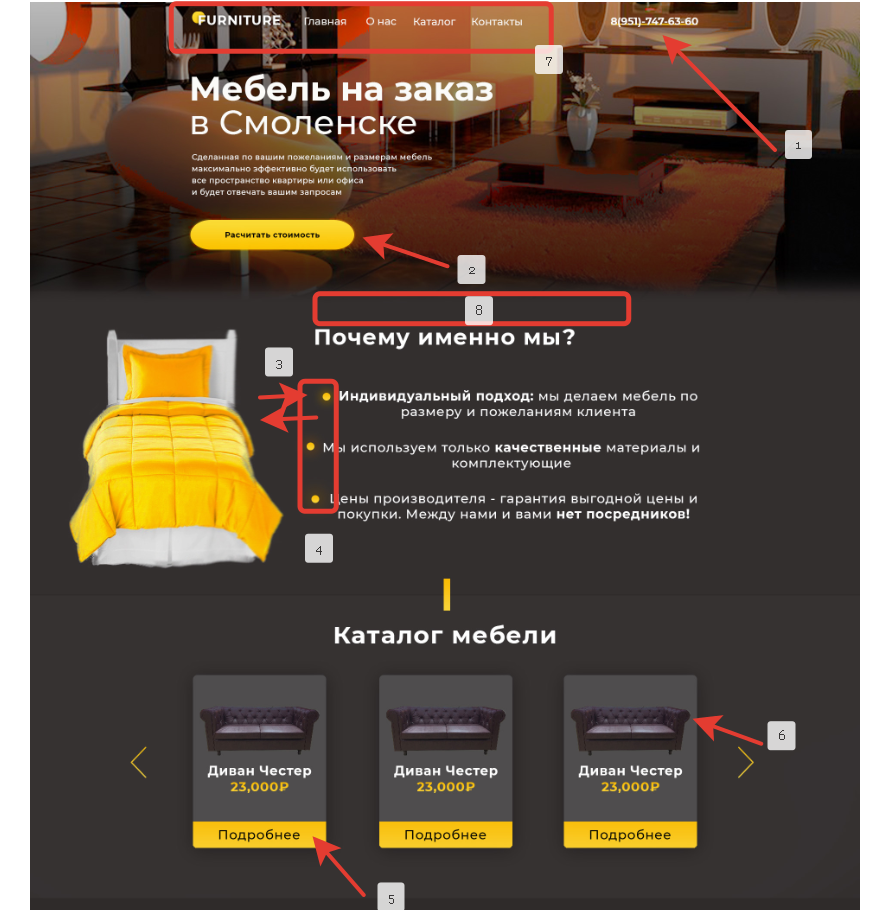
For the first time in my life, I tried to design a landing page.
Please describe in detail all the errors and how they can be corrected.

Answer the question
In order to leave comments, you need to log in
Good afternoon.
What problems do I see in your Landing slide. 
1. The phone is somehow strange to underline with a line. it is better to add an icon on the edge. to select a phone number.
2. The button is very elongated, the text in it seems very small. (here you need to play with the button and the text)
3. The distance between the bed and the text with dots is quite close.
4. The points go in some kind of ladder, this is not very good, it seems that you forgot to align them.
5. the text in the "details" card is too close to the borders of the card, both above and below
6. The sofa on the left and right sides is too close to the borders of the card, there is no air.
7. the site menu is not visible, it is strongly adjacent to the top, plus it merges with the background of the rear view. The logo, home, about us, catalog, contacts, are also strongly adjacent to each other.
8. the same problem as everywhere else, the text "Why us" has little air at the top of the page.
9. Looking at your site, you get the feeling that you all tried to place them as close to each other as possible.
I myself am also just learning design and don't know much. But I shared my thoughts with you, I hope my review will be useful to you.
But I would generally leave the border-radius, based on the first section.
Well, yes, remove the gradient from yellow to gray (the bed is in the second section).
Well, in general, for the first time is very good.
Didn't find what you were looking for?
Ask your questionAsk a Question
731 491 924 answers to any question