Answer the question
In order to leave comments, you need to log in
Please rate the design.
Goodnight.
I will say right away - I am not a designer, not a layout designer.
Completed my 2nd site redesign in my life.
Could you please tell me what is wrong with him, what can be added, for how much this can be sold for approximately (figuratively, I'm really just curious).
Answer the question
In order to leave comments, you need to log in
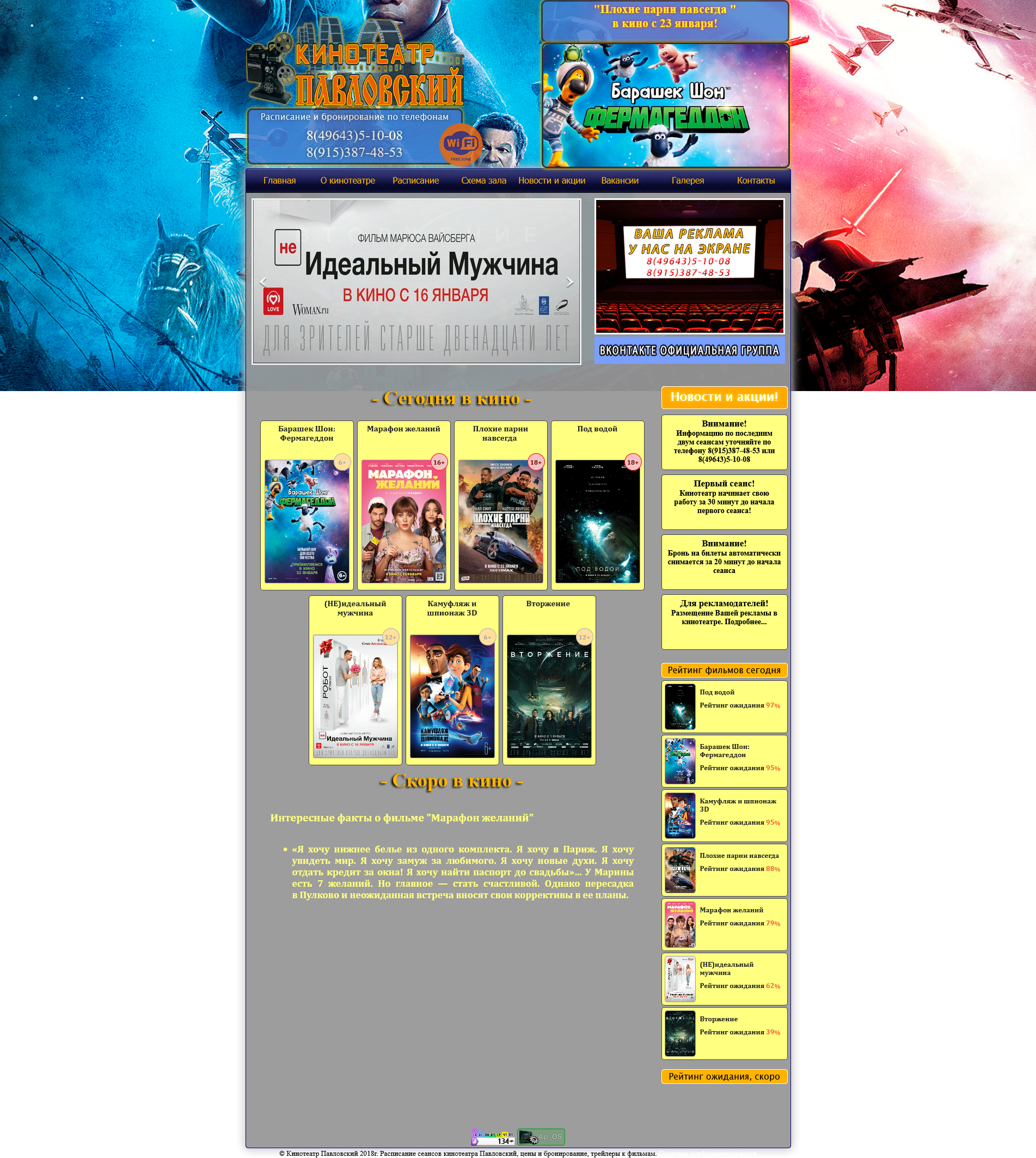
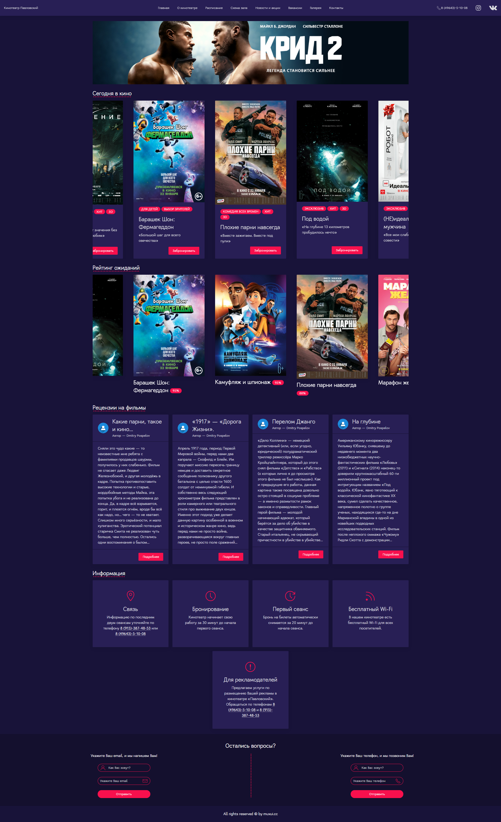
I don't like that the "Today at the movies" section turned into a horizontal slider.
I (I think, like many others) go to the cinema’s website to see what films are currently playing, click on those that interest you, see the schedule, and make a reservation.
With you, I stumble on the first step "see what films are on now", I want to see everything at once, I don't want to scroll through the slider. Yes, I agree that they may not fit on one screen, but I'd rather scroll down a little than dance with a slider.
The top banner with a creed - what is it? Is this movie out already? or will it come out in the future and is this his advertisement? I do not understand. Maybe it's just that the banner is poorly chosen, but everything will be clear in production, but just in case, did you mention
the Expectation Rating? Does anyone need it?
Okay, let's imagine what you need: why is 95% of the content of this block repeating the "Today at the cinema" block? Can merge? If you don't want to merge - okay, but why is it so huge, on a par with the main section - "Today at the Movies"?
Reviews of films - ok, but I would only rename them to "Last Reviews" - why specify what exactly is for films, this is a damn site of a cinema, what else can there be reviews for.
Block with information - I liked
Footer - ok
As a result:
Redesign - well, ok, visually made better, it's not difficult.
UX - IMHO, terrible, if I had to choose which site to use, the old version or your redesign, I 100% chose the old version, because. he's way more comfortable.
This is the opinion of an ordinary user, I have never developed interfaces or anything like that. I don't mean to offend you, just an opinion.
How did the "designers" draw pseudo-content get it... Who told you that there would be such a quantity of text in the reviews? I can write 5 lines and 100500 + no paragraphs = a solid wall of text that I want to scroll through.
Information - make 5 elements at once, do not follow the lead of the block that is higher.
A strange decision to place icons in forms on different sides. What for? For what? Show what an awesome designer you are? Wipe your decision.
Rating of expectations - really why? How is it determined? Voting "waiting / not waiting"? Well, if 10% of your visitors vote, will it become easier?
Consider no footer.
It would be impossible to make it worse than it was. So it’s incorrect to measure in comparison, and if you evaluate it as an independent one, it’s very bad
Didn't find what you were looking for?
Ask your questionAsk a Question
731 491 924 answers to any question