Answer the question
In order to leave comments, you need to log in
Optimizing responsive images for Google PageSpeed?
Hello colleagues. I encountered such a problem, recently in my office they began to test pages using Google PageSpeed, I do not argue that the tool is good. But I have some questions about image optimization. Now I will give an example:
Usually, responsiveness is added to images (following the bootstrap example):
img{
    max-width:100%;
    height:auto;
}

Answer the question
In order to leave comments, you need to log in
the factor is
those who chose item 2 - clinical idiots, do not let the CEO
Full & thumb only.
In any case, the ranking should not be affected.
GPS is just a recommendation, nothing more.
PS itself recognizes small ones as thumb and indexes Full.
More requests - well, ce la vie.
Although there are sites with paragraph 2, all zbs.
if you want to optimize both the size and queries, then you need to understand what sizes are often used by users.
if they almost always not only scroll through all the middle pictures, but also almost always expand everything to the full screen, then option 2 is understandable.
but something tells me that God forbid, if half of the users scroll through all the pictures, and no more than 1-5% of pictures. then obviously 1.
most likely users will often scroll through the average size (almost all pictures and almost all users) and rarely open to full screen. it is better to take the average size and use them for small ones. and for the largest - separately.
but it is best to follow the statistics for your users. maybe small details are important to users in the pictures and they will always expand to the fullest.
for p1 there is img srcset
yes in any case it is better to make several different images
why force the same mobile users to download huge pictures?
Or is it useless to download huge pictures on the desktop, if the user, most likely, will not even look at them?
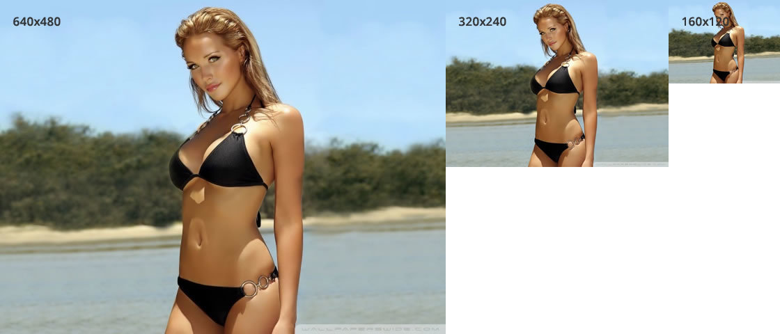
Gentlemen, I probably expressed the thought incorrectly, I'm specifically talking about the second point. I'm not talking about the largest picture (which opens on clicking a link that opens a typical fantasy box), but I'm talking about a medium-sized preview (on which a magnifying glass is drawn, for example it is 640 by 480), which can also be used for tiny previews (thumbs) which are below. That is, we transfer one average 640 by 480 and use it in previews, otherwise we will have to load both average 640 and small thumbs, which, for example, will be 160 by 120, because it will be 2 times more requests, etc.
Didn't find what you were looking for?
Ask your questionAsk a Question
731 491 924 answers to any question