Answer the question
In order to leave comments, you need to log in
Need advice on Android app design. What well? What is wrong?
I am making an android app. Made a design.
As a designer, I am not strong,
so I need advice from those who have already been involved in application development.
Maybe some suggestions, advice?
I will be grateful!
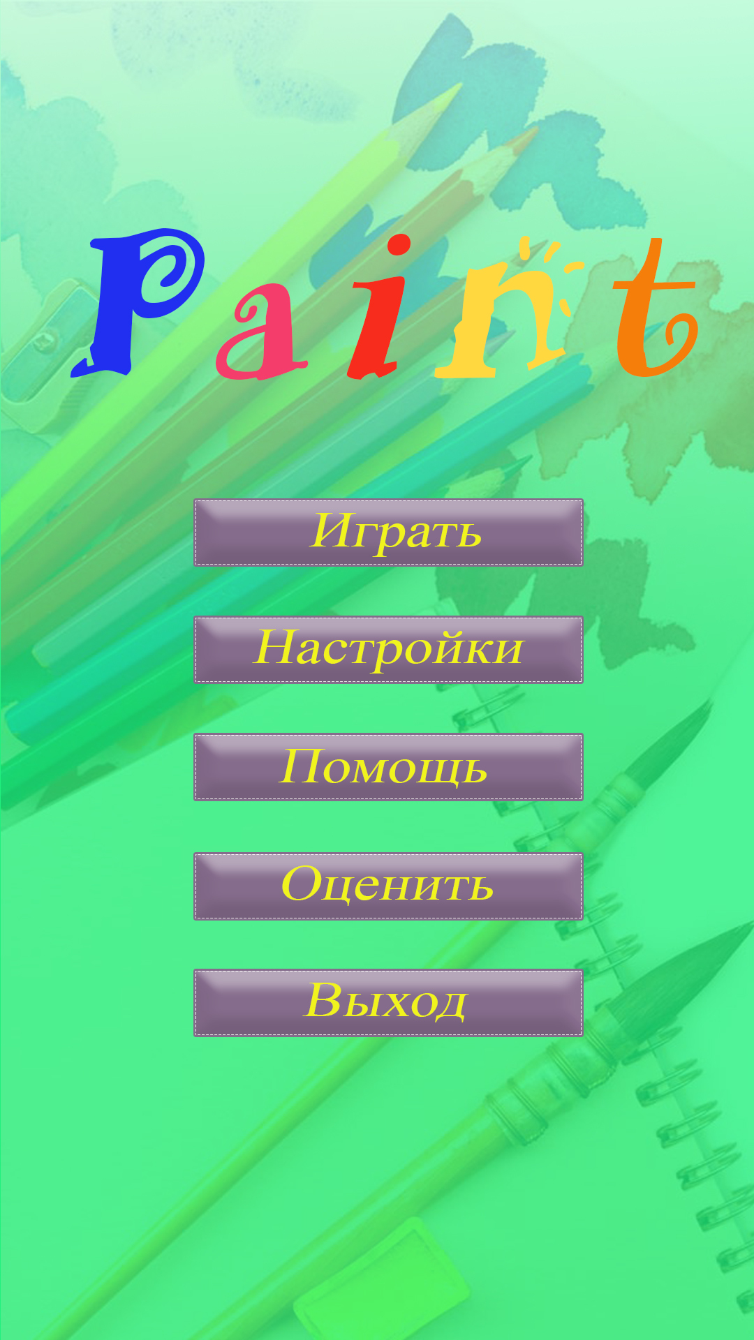
Main menu: 
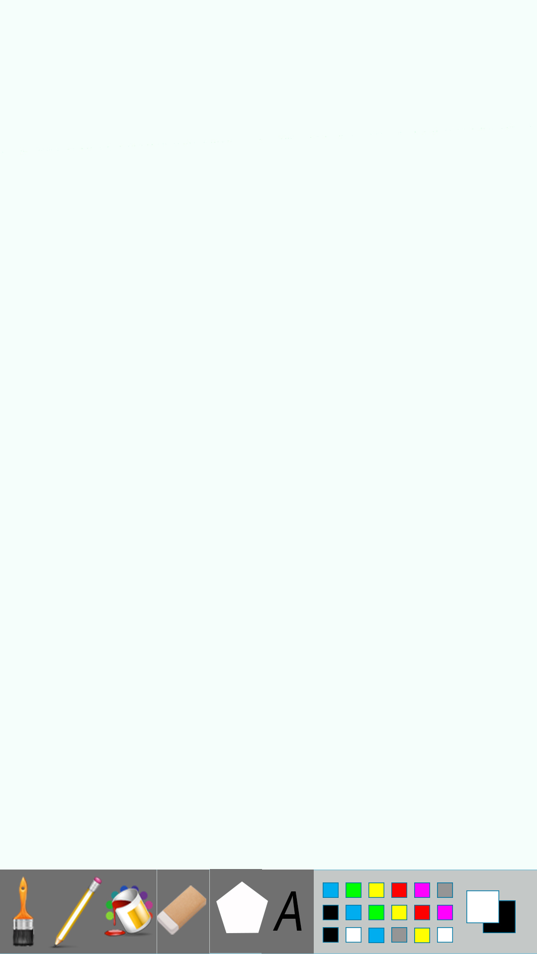
Drawing area: 
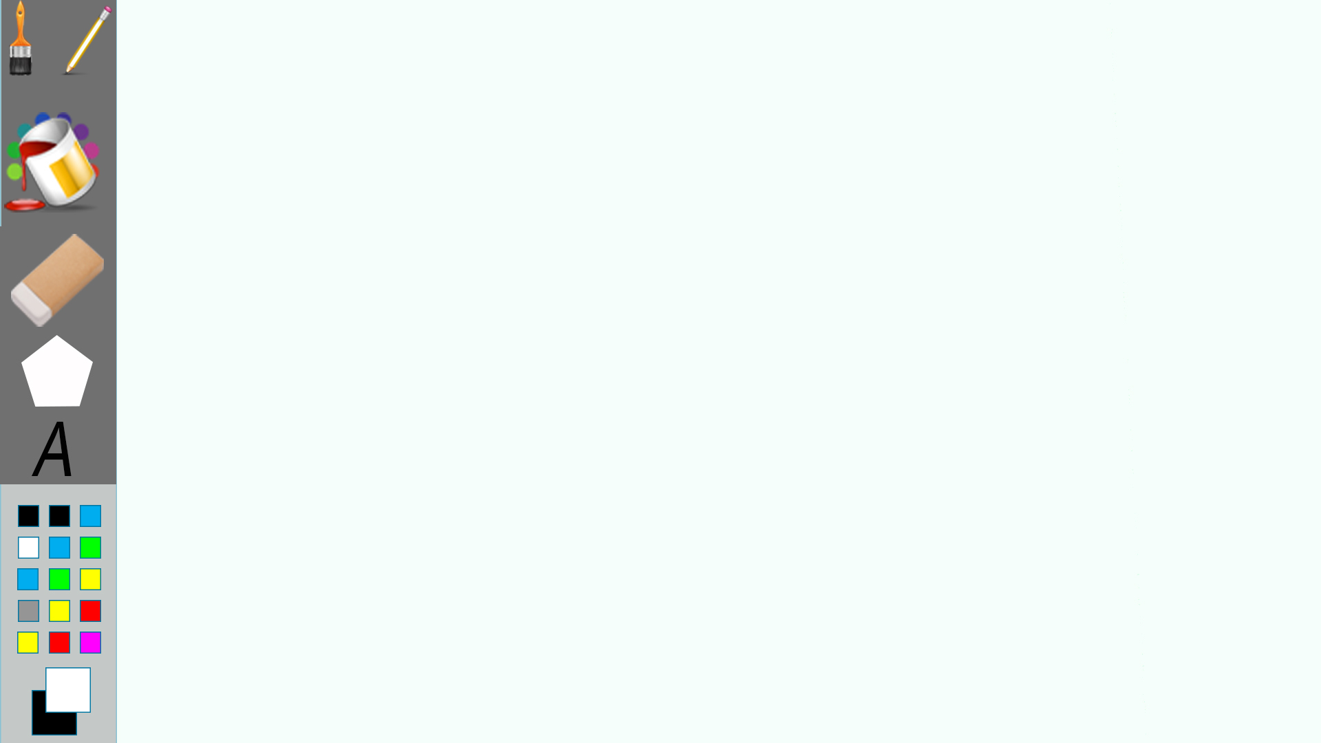
Drawing area (landscape):
Answer the question
In order to leave comments, you need to log in
In my opinion, Google has already told everything: https://www.google.com/design/spec/material-design...
The main question for the author of the game application:
How to play it and what is the ultimate goal of the game?!
It really depends on who the app is for and how people are supposed to use it.
From the base:
1. On the main menu, the yellow text on the purple buttons is difficult to read, the italic font also does not add readability.
2. There is a huge empty space on the drawing field, not used in any way. You can place hints there to help the user start interacting with the application.
Didn't find what you were looking for?
Ask your questionAsk a Question
731 491 924 answers to any question