Answer the question
In order to leave comments, you need to log in
Mobile menu not following styles?
Hello,
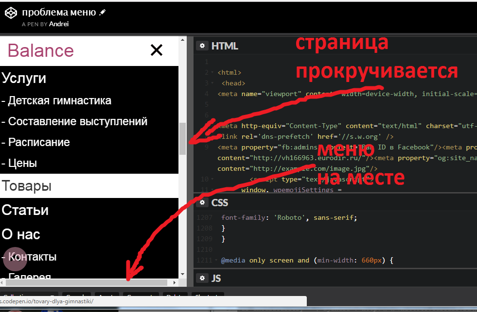
on the main page of the site in the mobile version, the mobile menu does not scroll down. those. when you first open it, you can scroll a little, and when it becomes the size of the screen, you can’t scroll it, although there are still menu items below. At the same time, it is clear that the page scrolls behind the menu, although you move your finger along the opened menu. 
besides that, the styles say that the width is 80% and the overflow is auto, but it does not obey, although everything is fine on other pages of the site. I tried to remove the html code of all page blocks one by one, but it did not help.
How to make it possible to scroll the menu in the mobile version, here is the PEN for tests
PS If you write in the styles not men{display: none;} as it is now, but men{display: block;}, then it scrolls as it should and everything is fine, then the default menu is open when loading
Answer the question
In order to leave comments, you need to log in
1. men has inline, put block and everything is ok.
2. #tmenu add z-index: 9999; otherwise the menu is hidden under something down there, a slider or something
It's easier to re-do it in a simpler code and way than to look for an error in this)
Didn't find what you were looking for?
Ask your questionAsk a Question
731 491 924 answers to any question