Answer the question
In order to leave comments, you need to log in
Mini Navigation Drawer. Experience using *preferably without third-party libraries*?
Good day =)
Unfortunately, Google designers and developers live in different universes that do not always intersect ..
For
example, in the design guideline there is an interesting example of behavior called Mini Navigation Drawer 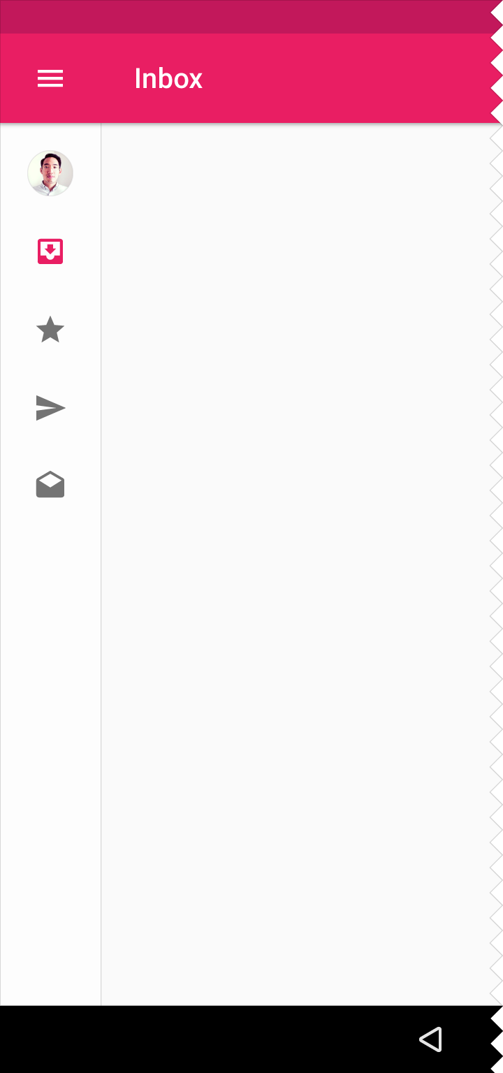
beauty in the code ...
Question .. has anyone used this behavior in their projects? Can you share your implementation experience?
Answer the question
In order to leave comments, you need to log in
Mini variant is a variation of the persistent navigation drawer. And persistent is not recommended for mobile - Persistent navigation drawers are acceptable for all sizes larger than mobile. Persistent navigation drawers are not recommended for apps with multiple levels of hierarchy that require using an up arrow for navigation.
Okay.. I'll post the option - on which I stopped at the moment .. I had to light up the lib that Mike Penz posted .. *although in my case there may be headaches with AccountHeader, but this does not apply to the question*
In any case, if someone has experience other implementation, please share it
private AccountHeader headerResult = null;
    private Drawer result = null;
    private MiniDrawer miniResult = null;

    private Crossfader crossFader;

    private void setNavigationDrawer(Bundle savedInstanceState, Toolbar toolbar) {

        // Create a few sample profile
        // NOTE you have to define the loader logic too. See the CustomApplication for more details
        final IProfile profile = new ProfileDrawerItem()
                .withName("Mike Penz")
                .withEmail("[email protected]")
                .withIcon("https://avatars3.githubusercontent.com/u/1476232?v=3&s=460");

        // Create the AccountHeader
        headerResult = new AccountHeaderBuilder()
                .withActivity(this)
                .withSelectionListEnabledForSingleProfile(false)
                .withHeaderBackground(R.color.colorNavBackgroundColor)
                .withTextColorRes(R.color.colorBlackTextColor)
                .addProfiles(
                        profile
                )
                .withOnAccountHeaderListener(new AccountHeader.OnAccountHeaderListener() {
                    @Override
                    public boolean onProfileChanged(View view, IProfile profile, boolean current) {
                        miniResult.onProfileClick();
                        //false if you have not consumed the event and it should close the drawer
                        return false;
                    }
                })
                .withSavedInstance(savedInstanceState)
                .build();

        DrawerBuilder builder = new DrawerBuilder()
                .withActivity(this)
                .withToolbar(toolbar)
                .withSelectedItem(-1)
                .withAccountHeader(headerResult) //set the AccountHeader we created earlier for the header
                .addDrawerItems(
                        new PrimaryDrawerItem().withName(R.string.drawer_item_first).withIcon(R.drawable.nav_client_icon).withIdentifier(1),
                        new PrimaryDrawerItem().withName(R.string.drawer_item_third).withIcon(R.drawable.nav_event_icon).withIdentifier(2),
                        new PrimaryDrawerItem().withName(R.string.drawer_item_second).withIcon(R.drawable.nav_orders_icon).withIdentifier(3),
                        new DividerDrawerItem(),
                        new PrimaryDrawerItem().withName(R.string.drawer_item_fourth).withIcon(R.drawable.nav_settings_icon).withIdentifier(4),
                        new DividerDrawerItem(),
                        new PrimaryDrawerItem().withName(R.string.drawer_item_fifth).withIcon(R.drawable.nav_exit_icon).withIdentifier(5)


                ) // add the items we want to use with our Drawer

                .withOnDrawerItemClickListener(new Drawer.OnDrawerItemClickListener() {
                    @Override
                    public boolean onItemClick(View view, int position, IDrawerItem drawerItem) {
                        if (drawerItem instanceof Nameable) {
                            Toast.makeText(MainActivity.this, ((Nameable) drawerItem).getName().getText(MainActivity.this), Toast.LENGTH_SHORT).show();

                        }
                        switch (position){
                            case 1:
                                showFragment(new ClientsFragment(),true,true, ClientsFragment.class.getSimpleName());

                                break;
                            case 2:
                                showFragment(new EventListFragment(),true,false, EventListFragment.class.getSimpleName());
                                showFragment(new EventDetailsFragment(),false,false, EventDetailsFragment.class.getSimpleName());
                                break;
                        }

                        miniResult.onItemClick(drawerItem);

                        return true;
                    }
                })
                .withSavedInstance(savedInstanceState);


        // build only the view of the Drawer (don't inflate it automatically in our layout which is done with .build())
        result = builder.buildView();

        // create the MiniDrawer and deinfe the drawer and header to be used (it will automatically use the items from them)
        miniResult = new MiniDrawer()
                .withDrawer(result)
                .withAccountHeader(headerResult);

        //IMPORTANT Crossfader specific implementation starts here (everything above is MaterialDrawer):

        //get the widths in px for the first and second panel
        int firstWidth = (int) UIUtils.convertDpToPixel(200, this);
        int secondWidth = (int) UIUtils.convertDpToPixel(72, this);

        //create and build our crossfader (see the MiniDrawer is also builded in here, as the build method returns the view to be used in the crossfader)
        crossFader = new Crossfader()
                .withContent(findViewById(R.id.linear_layout_container))
                .withFirst(result.getSlider(), firstWidth)
                .withSecond(miniResult.build(this), secondWidth)
                .withGmailStyleSwiping()
                .withSavedInstance(savedInstanceState)
                .build();

        //define the crossfader to be used with the miniDrawer. This is required to be able to automatically toggle open / close
        miniResult.withCrossFader(new CrossfadeWrapper(crossFader));

        //define a shadow (this is only for normal LTR layouts if you have a RTL app you need to define the other one
        crossFader.getCrossFadeSlidingPaneLayout().setShadowResourceLeft(R.drawable.material_drawer_shadow_left);

}Didn't find what you were looking for?
Ask your questionAsk a Question
731 491 924 answers to any question