Answer the question
In order to leave comments, you need to log in
Menu/responsive button issue?
Tell me what the problem is, it's just a layout for layout from a video course.
The fact is that on a computer in Google Chrome, when allowing mob. Phone (320x568) button looks fine, that one works too.
And when I tested on the phone, the button looks like in the picture. What should be done? 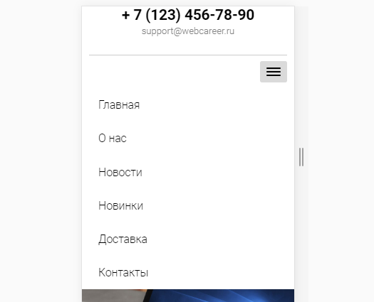
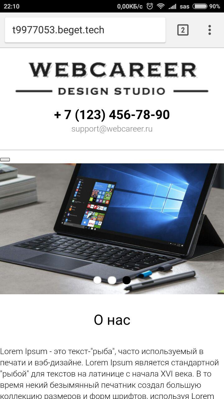
t9977053.beget.tech - site
materials - https://drive.google.com/open?id=10S6LPnSznymlr-Z-...
Answer the question
In order to leave comments, you need to log in
I agree with commentators about caching. I myself use the gallp environment with browser-sync in my work. It is very convenient to watch the layout on several devices at once, plus - there are no problems with clearing the cache.
Or trick browsers manually by simply substituting different versions in the get parameter for styles.
Didn't find what you were looking for?
Ask your questionAsk a Question
731 491 924 answers to any question