Answer the question
In order to leave comments, you need to log in
Layout pros, please rate the work of a novice layout designer?
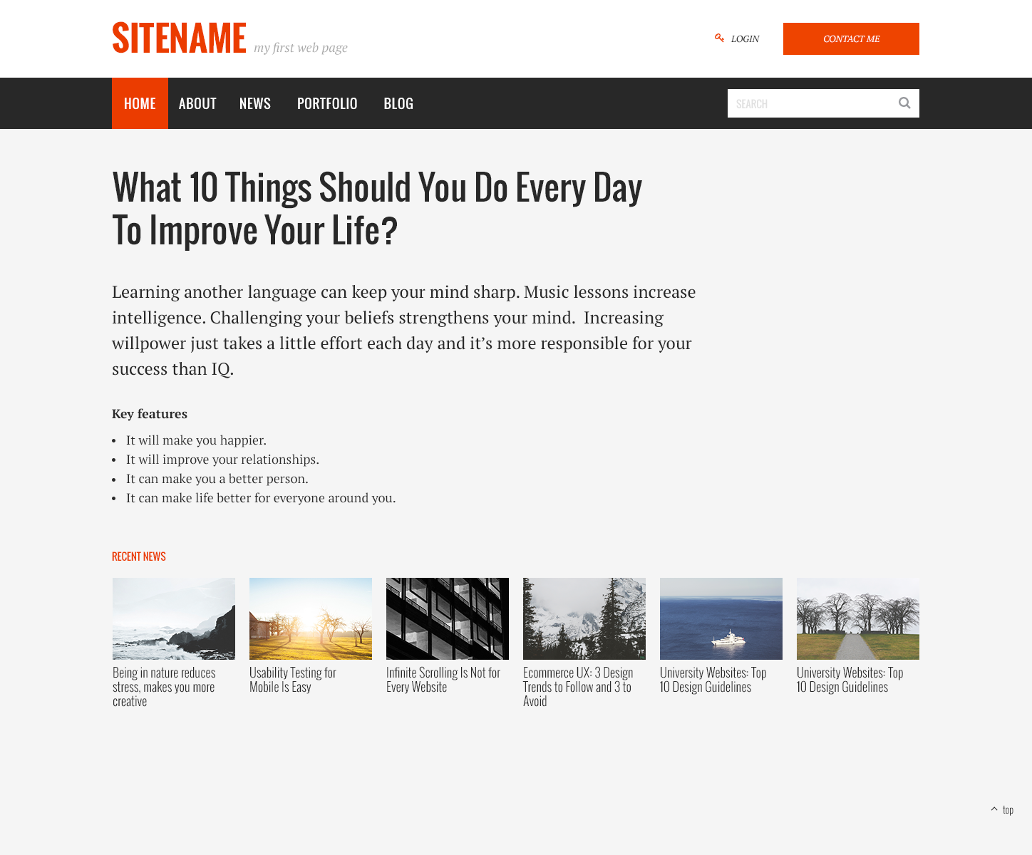
People, please help me understand what is wrong in the layout, judge strictly, I really want progress, I'm a beginner layout designer and I'm trying to find a job, there was a task from one company (file attached): 
1. Page layout (attached file).
- PSD 2 HTML page layout
- 12 columns grid
- Responsive, adaptive for mobile devices
- Need pixel perfect layout
- Google fonts font
As a result, I did it, and they wrote to me that there are sooooo many errors, help me understand where,
Here is the result https:// annaumi.github.io/test-task-from-fruitful-...
Pros help!
Answer the question
In order to leave comments, you need to log in
Open the result, and next to it, open the image you attached. And flip back and forth many times. Noticeable differences?
Fonts (fonts-size, line-height, etc.), colors (the background is generally different, the text in many places is of a different shade), element positioning is also different
PS If you haven't started using it yet, here is a good plugin for Chrome for pixel perfect : PerfectPixel by WellDoneCode
PSS This is from a visual point of view. Now there will be some time, I will look at the code
Firstly, the layout is not on container >>> why use margin >>> start from the container (( this is not good )).
Secondly, have you seen your nav? Also not according to the container (( you need to reset the padding of the first element or shift the entire nav to the left by item { padding } )) And in general, padding in your case should be set on the link element (( link )) and not on the item element ( (gross mistake)).
This is what first caught my eye. There is no time to watch the rest.
It is interesting how it is interesting for employers to hire such a layout designer with zero knowledge. Now employers need the layout designer to know:
preprocessors,
layout so that everything does not fall apart,
JS ((at a high level, not just jquery)).
Collectors.
BEM (( It will be a very big plus, at least at the level of selectors)).
Package managers, the basics of working with the Linux console..
I would not call you a coder.
For me, this is an error in the task;) either adaptive or responsive.
1) Links in the menu only work when you click on the link text. Same for the mobile version. The click should work across the entire hover area.
2) In the mobile menu, the last link has an extra border.
3) The open mobile menu at high resolutions is not removed.
4) Pictures in "RECENT NEWS" are usually also made as links that lead to news.
It remains a mystery to me why margin-right: 19px is set on .news-wrap.
Because of it, the pictures are placed crookedly relative to the container.
Didn't find what you were looking for?
Ask your questionAsk a Question
731 491 924 answers to any question