Answer the question
In order to leave comments, you need to log in
Is it really so bad with fonts in linux (ubuntu)?
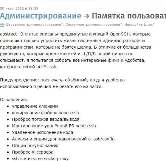
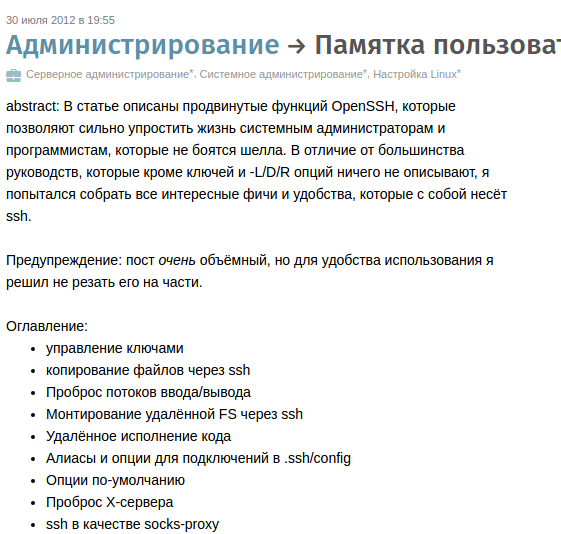
The topic where it just didn’t come up, I re-read all the forums that they just don’t offer to do, I tried a lot, but nothing really helps. About microsoft patents regarding fonts, in the know. But is there really no solution? Here are two screenshots of the page in google chrome:
windows7 : 
from Ubuntu : 
On ubunt, I have enough for 10 minutes with this font. then my eyes start to hurt.
Is there a solution? How do you deal with the problem?
Answer the question
In order to leave comments, you need to log in
askubuntu.com/questions/578057/installation-of-fon...
https://www.google.com.ua/search?q=ubuntu+how+to+i...sudo apt-get install ttf-mscorefonts-installer
In Ubuntu (if it is Ubuntu) they simply castrated the settings.
You have to separately install ubuntu-tweak, which still has anti-aliasing settings.
I have them in Xubuntu out of the box.
The system font of normal outlines is calmly selected (I have Droid Sans, in the Liberation Sans browser), the "rainbow" is turned off as unnecessary, but, of course, hinting is turned on. Frankly, both of your screens break my eyes ...
PS Yes, in such a topic you need to answer with screenshots. Correct:
PPS Actually, the default font in the browser is unimportant - Verdana is registered in the style of the site, and if it is in the system, then it is displayed.
PPPS I looked at the same page at home (22" TN), did not find any differences from the screenshot taken at work (19" MVA). To be honest, this is what seems to me more important than the details that you can find fault with in the screenshot. I have the opportunity to make the same settings on different machines - and not break my eyes, changing from one to another. This is wonderful!
Didn't find what you were looking for?
Ask your questionAsk a Question
731 491 924 answers to any question