A
A
Artem Masikov2020-04-05 13:58:37
Design
Artem Masikov, 2020-04-05 13:58:37

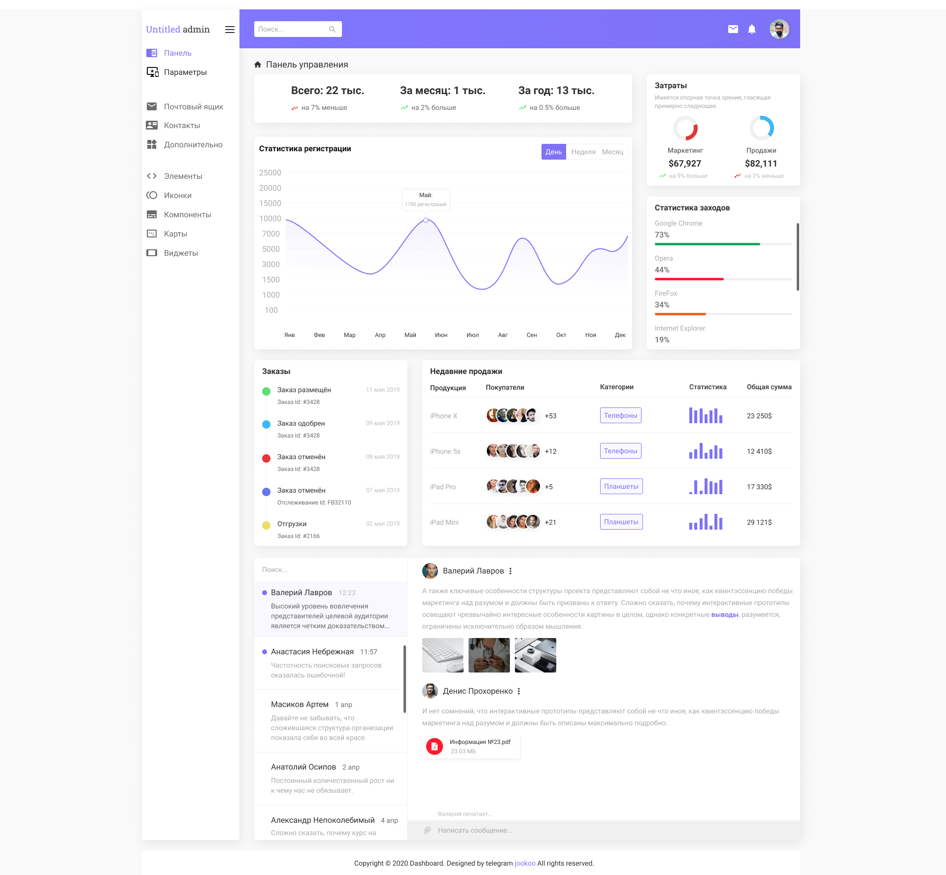
I'm learning web design, what are the mistakes?

Good afternoon, not long ago I started studying web design for about 3 months. I would like to see a comment from more experienced designers and point out errors in this work. Thank you very much in advance.
Link to figma5e89b9397363f991085088.png
Answer the question

In order to leave comments, you need to log in

2 answer(s)
I
Ivan Bogachev, 2020-04-05
@sfi0zy

In general, everything is neat, so comments are more likely reasons for reflection and licking what is.

  • “Untitled admin” in the corner - such names tend to be quite long and it will no longer fit into the sidebar. Can it somehow be moved to the center, to the “control panel”? And why is this the only inscription in a font with underscores?
  • The icons are all similar and not intuitive, can you play with them? I wouldn't have guessed about the maps at all if I hadn't read it.
  • On the right, the colors are somehow reversed - the growth is red, and the decline in sales is blue. It would be more logical to make growth green and fall red.
  • The same with orders - one “order canceled” is red, and the other, the same, is purple. Let all canceled ones be red. And browsers - why is one green, the other red, and the third even orange? If it doesn't mean anything, let everyone be neutral - purple.
  • There are problems with contrast, especially at the bottom. Pass grays vary, especially on a monitor that shines upwards.
  • A plate with a file with a shadow. A controversial decision: when some elements with shadows lie on top of other elements with shadows, this breaks the perception a bit. Can it be distinguished in some other way?
  • The chat below, after scrolling one and a half screens, is kind of sudden. There was nothing on top of him. Maybe under the “mailbox” there should be a “chat” item in order to go to it (well, or to a separate page with it)?
  • Probably the purple stripe needs to be stretched further, and there should not be a shadow from the panel on the left (but it's not entirely clear what screen resolution it is).

Well, there should be a mobile version.

M
Mikhail Proskurin, 2020-04-05
@mixail_fet

Hey!
From a design point of view - more or less a good start, but a lot of problems in UX.
I left a few comments in the layout that will help you bring the layout to a more or less convenient look.

Didn't find what you were looking for?

Ask your question

Ask a Question

731 491 924 answers to any question