Answer the question
In order to leave comments, you need to log in
I can't figure out how to work with raster graphics for responsive design?
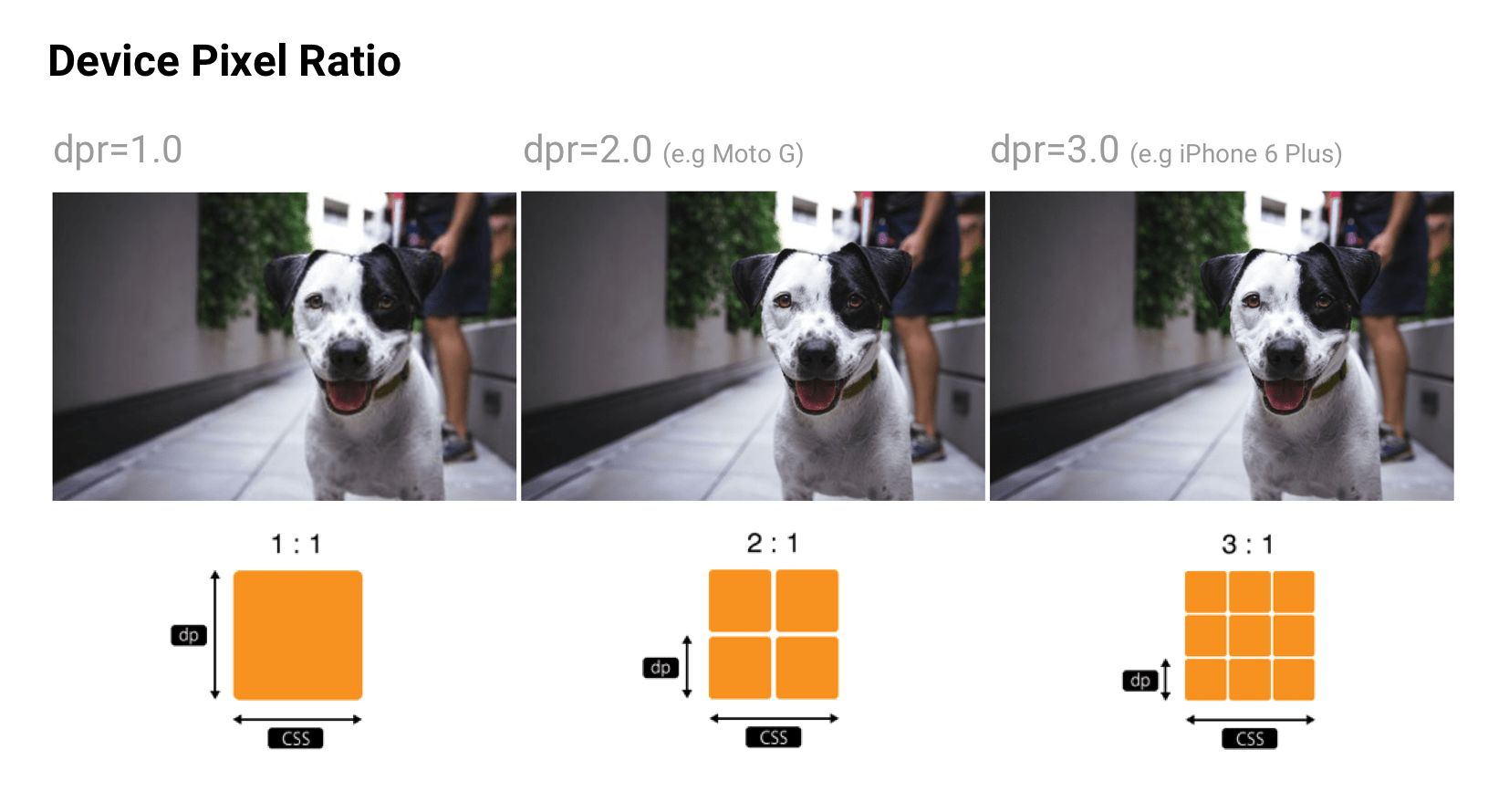
Good day dear Toaster! I read a lot on the Internet about DPR , graphics adaptability, etc. And now the porridge in my head that I can not clear. For some devices, DPR reaches 4. And, for example, I need to display a 200x200 image . It turns out that for this device you need to load a picture as much as 800x800 or am I misunderstanding something? And how to do it correctly, for example, the srcset attribute is not supported by all modern browsers. In general, help, please, to understand all this.
Answer the question
In order to leave comments, you need to log in
To find a compromise between the quality and volume of data, I suggest making an average size. In your case 400*400 for example. Jambs will be noticeable either under a microscope, if on a mobile phone or if on a TV, then in the case of looking at the screen point-blank from 30 cm. But no one does that. In other cases, it will look normal everywhere.
As an option, make layout for large devices in such a way that the picture does not open at all 800, but remains at a maximum of 400. Then everything will be perfect.
Related : No @2x graphics for retins, does it make sense to interpolate them in Photoshop?
srcset is not supported only by IE. As far as I know, these problems can only occur with retina displays, so you can use srcset without fear. And yes, if you have vector graphics, then you don’t have to worry about srcset at all, because its dimensions will be identical on all devices.
Didn't find what you were looking for?
Ask your questionAsk a Question
731 491 924 answers to any question