Answer the question
In order to leave comments, you need to log in
I ask for help in choosing resources for the program
Miniproject - visualization of a warehouse. At this stage, there are 2 options for the design of the map:
1: 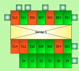
2: 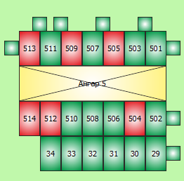
The code is good, but the visualization sucks (I can see for myself, I'm a lousy artist).
Question - tell me either a set of resources on this topic, or (if someone has already done something similar) share a beautiful implementation.
Thank you!
Answer the question
In order to leave comments, you need to log in
I am not an expert in this area, but in my opinion you have excellent visualization, just remove the gradients, make the colors and diagonal lines lighter relative to the text. A beautiful infographic is when there is nothing superfluous.
Strangely
, I always thought that, other things being equal and the lack of talent for infographics, the most informative is the GOST drawing
isicad.ru/uploads/img/2142_AC_AP.jpg , for example
, while toning and coloring individual elements are “improvements” for images with a level of complexity higher than that you gave an example
Didn't find what you were looking for?
Ask your questionAsk a Question
731 491 924 answers to any question