Answer the question
In order to leave comments, you need to log in
How would you design this block?
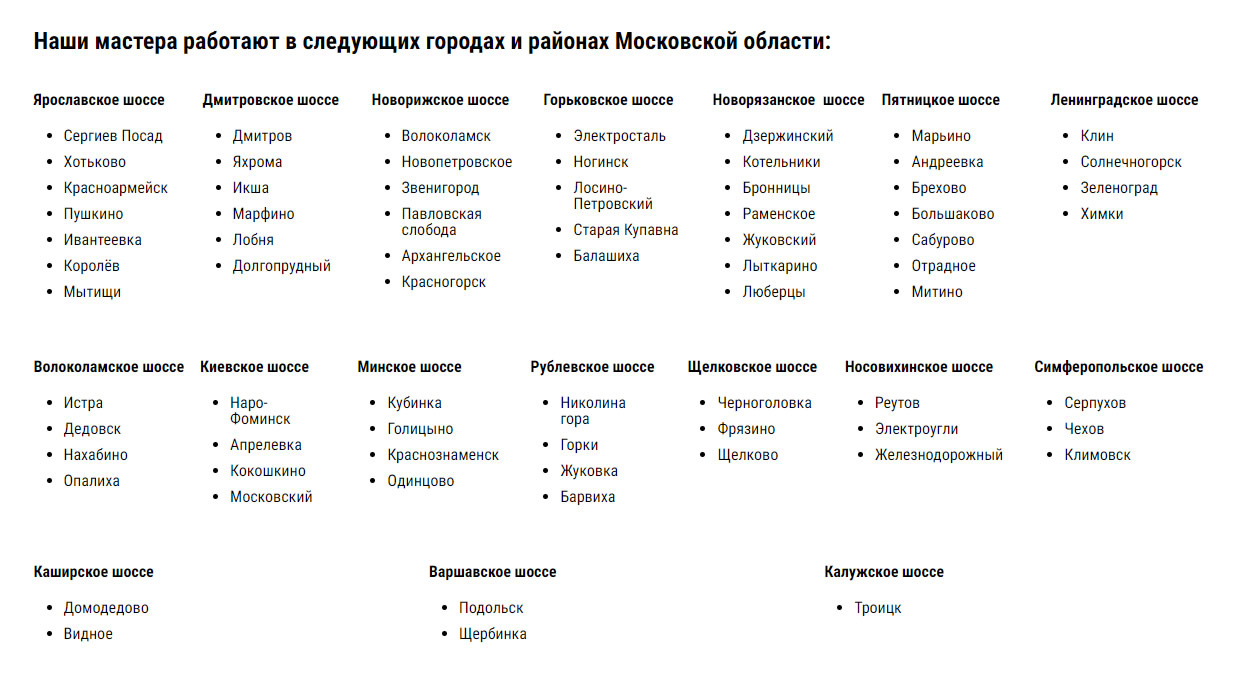
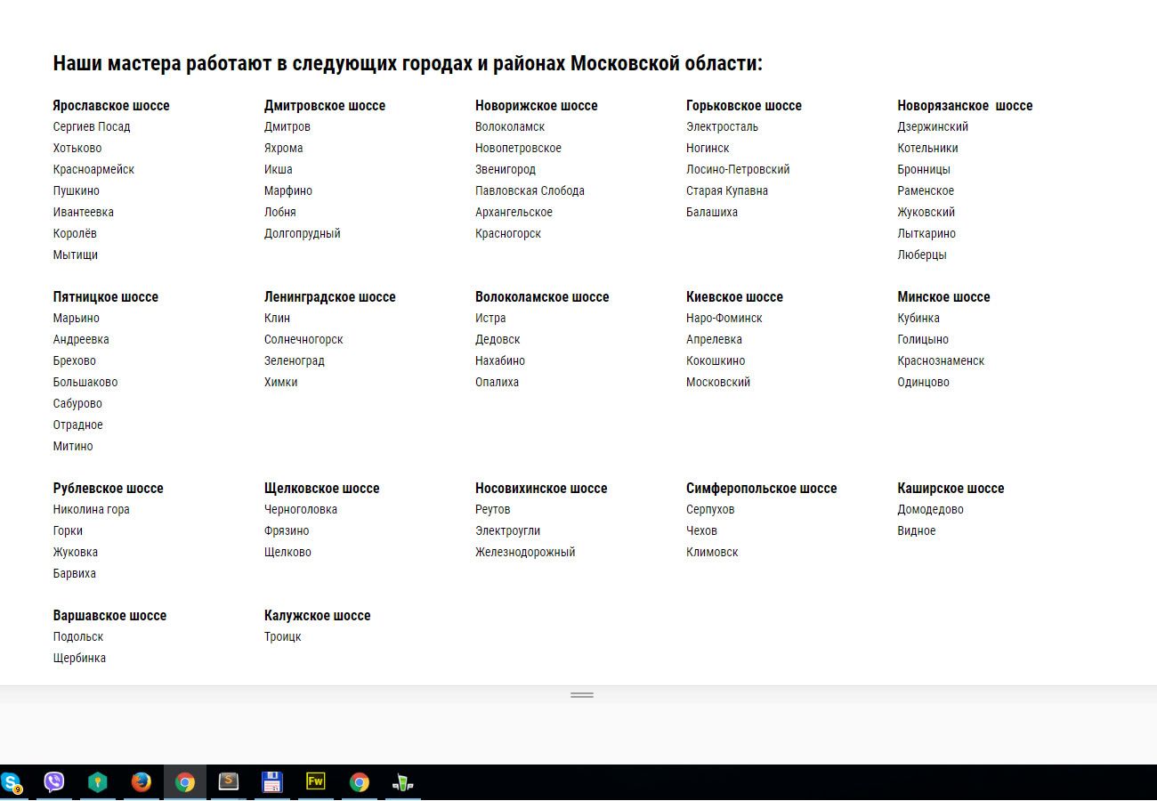
Gentlemen layout designers, how would you design this block visually. Blocks 17, the city as it is, it is unlikely that more will be added. I would not like to have large holes between the blocks, and so that everything looks somehow beautiful, symmetrical. But the problem is that there are 17 of them ... =)
In principle, you can make 6 in a row, it will turn out 6 6 5. I decided to write here, maybe someone will give a more brilliant idea?
Answer the question
In order to leave comments, you need to log in

Set flex-basis:20% and justify-content:flex-start
In general, it turned out succinctly, but there are big holes due to the fact that somewhere there are more cities, somewhere less. But it doesn't get any better than that, right? )
I think you put them on tight. In my opinion, the best option is to make 6 6 5, where 5 is aligned to the left
You can make it more beautiful))
Display, for example, 2-3-4 cities, and add a More button below, add js / jquery spoiler code and make part of the list a spoiler
And the user will run through this entire list in search of the city he needs? Isn't it easier to mark it all on a map? The grouping of cities along the highway is incomprehensible. Is it really more convenient than just a list of cities/towns sorted alphabetically? In addition, the logic of the arrangement of elements is not clear. It is quite obvious that the elements in such lists must be done in alphabetical order to make it easier to search. Ideally, you can add filters by district/highway if you really need to.
And if you want to get an answer regarding how best to arrange such data from a visual point of view, then do not put html, css, layout tags. Your question has nothing to do with layout (but you were given advice here only with regards to layout, not design). It is advisable to put such tags when you have already decided on the design and do not know how to lay out an already rendered element.
mumus play around with multi-columns column-count, if you don't like flex
it will give you the opportunity to get rid of holes under the blocks
Well, I would make blocks, give them float: left and width as a percentage in the right ratio. Well, the percentage for different lines is different. and there are already div and ul li
Didn't find what you were looking for?
Ask your questionAsk a Question
731 491 924 answers to any question