Answer the question
In order to leave comments, you need to log in
How would it be better to do (flexbox)?
The bottom line is that in the future I'm going to make a template for WP. It is necessary to make sure that the news in the container is displayed in two columns and, when added, also goes down, and next to it there is a slightly smaller sidebar (!) In the same container, what is the right way to do it?
Option 1:
Container with flexbox variables and three identical divs for news and sidebar Option 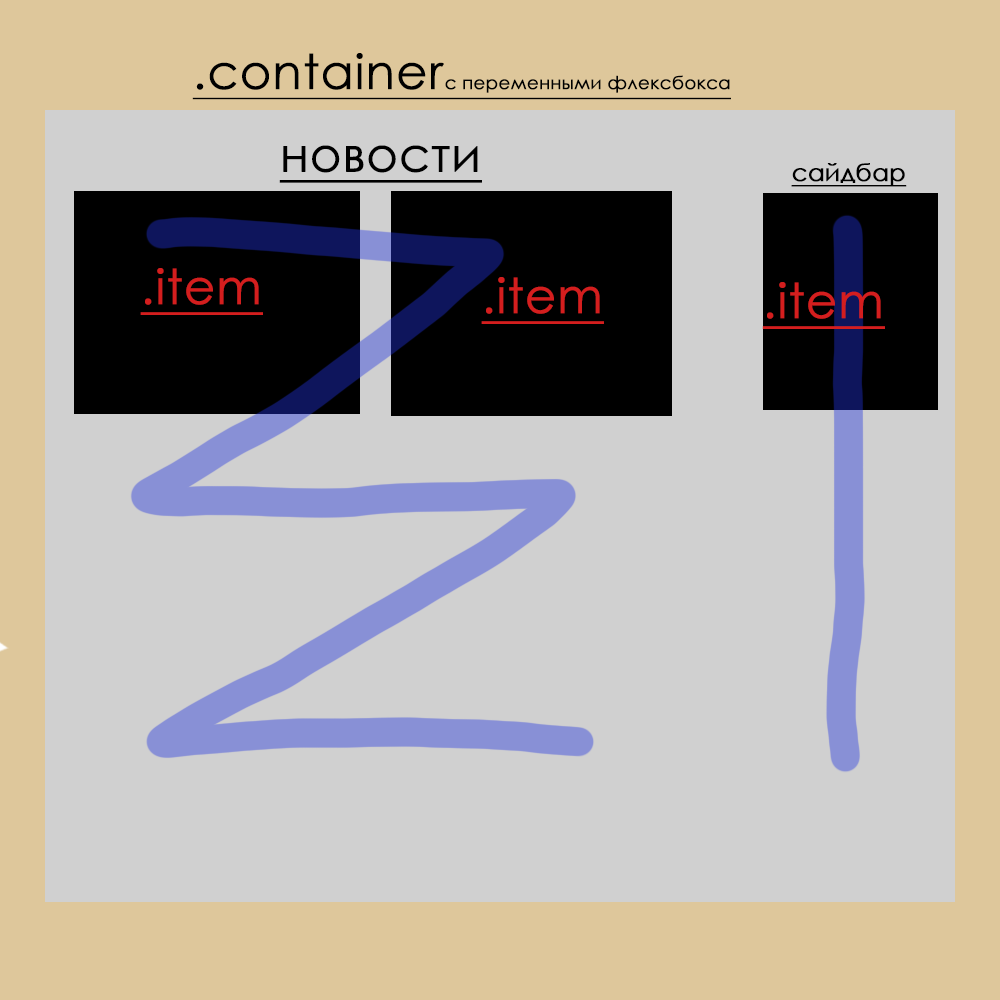
2:
Container with flexbox variables, two divs for news and a separate div for sidebar 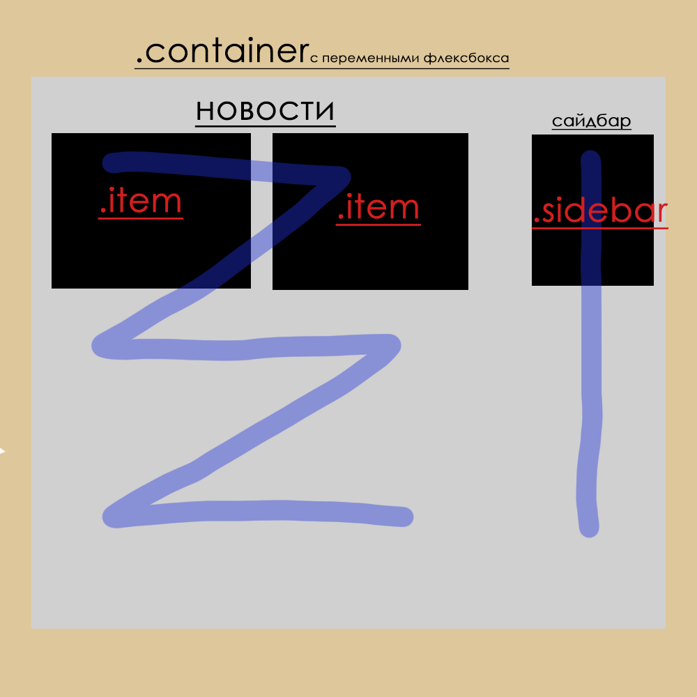
or your own version.
It seems like the second option is correct, but the size of the sidebar is not set via flex-basis
Update:
Or the third option (I thought of it a bit later :) )
A container without flexbox variables, inside another container for news already with flexbox variables on the horizontal c flex-wrap, then divs for the news itself, then a container for the sidebar with variables for the vertical, and then divs for the sidebars
Ie: bigcontainer>containernews> news containersidebar>sidebar
Answer the question
In order to leave comments, you need to log in
Something like this. https://codepen.io/anon/pen/KxEjxb
<div class="container">
  <section class="news">
    <div class="news__item">Новость</div>
    <div class="news__item">Новость</div>
    <div class="news__item">Новость</div>
    <div class="news__item">Новость</div>
    <div class="news__item">Новость</div>
  </section>
  <aside class="sideBar">Боковое меню</aside>
</div>.container{
display: flex;
max-width: 1200px;
background: #eee;
margin: 0 auto;
}
.news{
display: flex;
flex-wrap: wrap;
flex-grow: 1;
background: lightgreen;
}
.news__item{
flex-basis: 200px;
flex-grow: 1;
height: 300px;
margin: 10px;
background: lightblue;
}
.sideBar{
flex-grow: 1;
max-width: 400px;
}Didn't find what you were looking for?
Ask your questionAsk a Question
731 491 924 answers to any question