Answer the question
In order to leave comments, you need to log in
How to visualize data (table with 4 options) in a chart using Excel?
In Excel I have a table with data. There are 4 parameters: Method , Lattice , Number of lines , Accuracy .
Table in Excel: 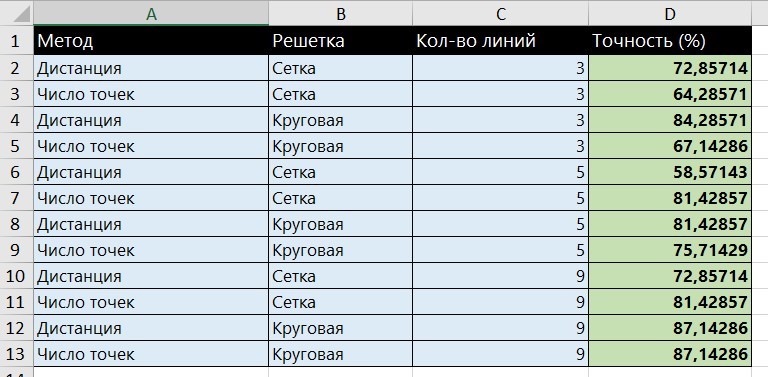
This is data on recognition accuracy depending on 3 other parameters: method, grid type and number of lines.
Answer the question
In order to leave comments, you need to log in
I propose the following:
1. finalize the table by correcting:
a) Convert the accuracy from numbers to percentages;
b) Write the word "Grid" in the same way in all fields. (in the attached file "Grid" is found in 2 ways of writing)
2. Make a pivot table and a pivot chart for it.
See screenshot for an example.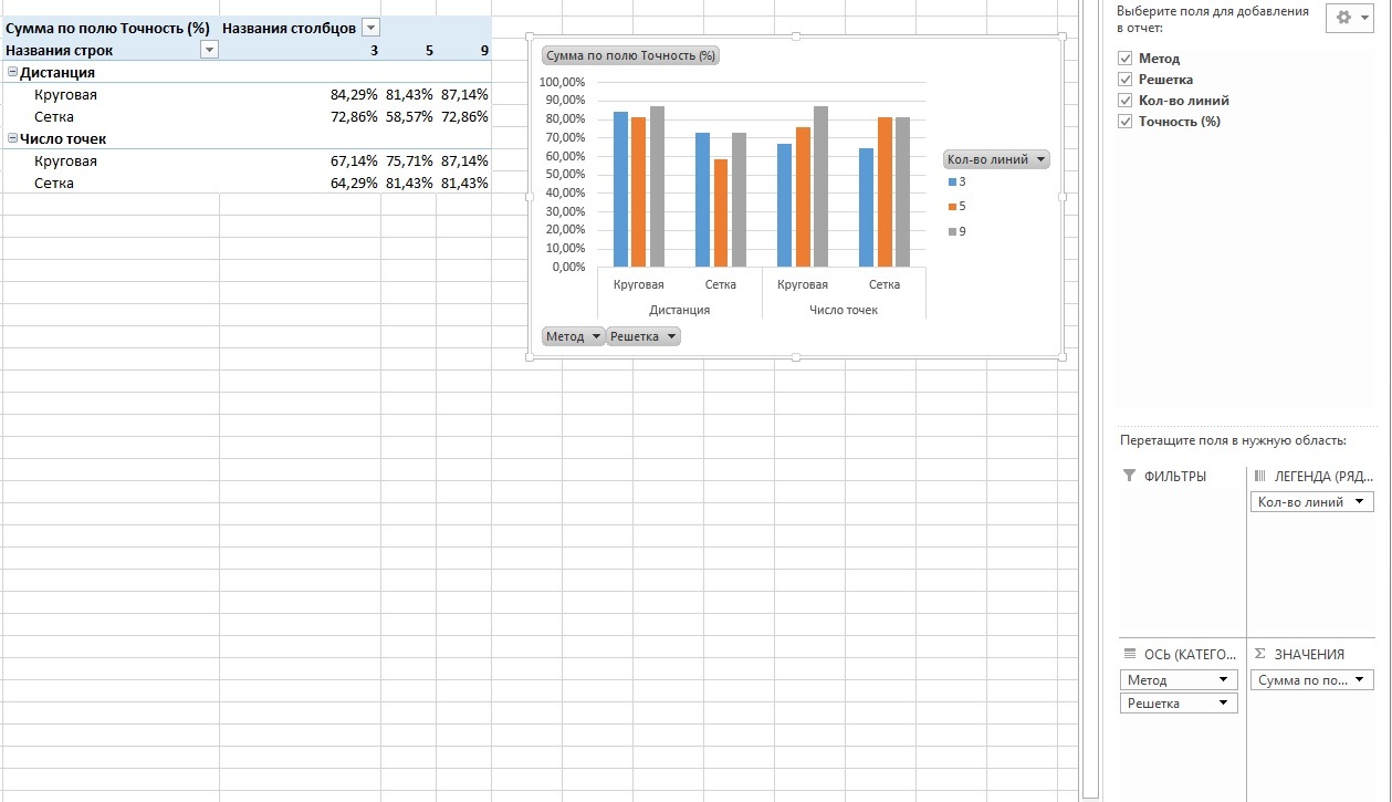
Didn't find what you were looking for?
Ask your questionAsk a Question
731 491 924 answers to any question