K
K
kpa182021-09-21 20:43:25
Google Chrome
kpa18, 2021-09-21 20:43:25

How to view the mobile version of the site, even if the desktop version opens in the inspector?

I'm studying through Google Chrome the page of the Apple site , but when I open the developer panel to view the code, and select a mobile device, I still see the desktop version. Is it possible to somehow explore the mobile version of the site using chrome?
614a19a156015563430650.png

Answer the question

In order to leave comments, you need to log in

3 answer(s)
D
Dmitry, 2021-09-21
@MaKvc

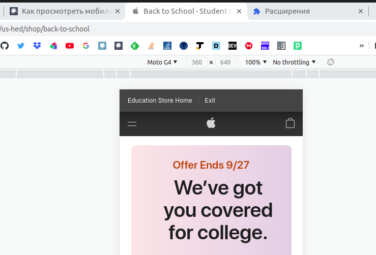
Well, when you go to the site, open the inspector, select the device (screen) and press F5. Refresh after screen selection.

S
Sergey Karbivnichy, 2021-09-21
@hottabxp

Change user-agent, for example using User-Agent Switcher and Manager or using another extension.
614a1c25f0385494294912.png

V
Valentine Dagzio, 2021-09-22
@Dagzio

  1. Open developer tools
  2. Next, turn on device mode by clicking the Toggle device mode button.
  3. In the panel that appears, you can select the device of interest from the drop-down list. The opened page adapts to the screen size of the selected device, and the user agent will be installed automatically.

If the device with the user agent of interest is not in the list, it can be added manually:
  1. In the drop-down menu with a list of devices, select Edit.
  2. Click the Add custom device button.
  3. Then add a device with the user agent of interest by filling in the required fields, then save the changes.

The newly created device will appear in the drop-down list.
User-agents of a mobile device can be found by yourself or used from this list: https://developers.whatismybrowser.com/useragents/...
You can also use the Chrome extension:
https://chrome.google.com/webstore/ details/userage...

Didn't find what you were looking for?

Ask your question

Ask a Question

731 491 924 answers to any question