Answer the question
In order to leave comments, you need to log in
How to understand from which device a person came in to enable the mobile version for him?
Previously, I always tied to the screen resolution, and through media queries. Actually, now too. Only here a question arose. Let's say the iPad has a resolution of 2560 pixels. But he needs to download the mobile version. So the question is how to properly organize it. I understand that you simply distribute the body class and prescribe the necessary styles. The question is how to determine from which device you entered, and at what point in the version to determine? What tools and with what? modernizer, please do not offer) There must be something minimalistic, quickly customizable, productive and not difficult to develop)
Answer the question
In order to leave comments, you need to log in
my approach is as simple as possible:
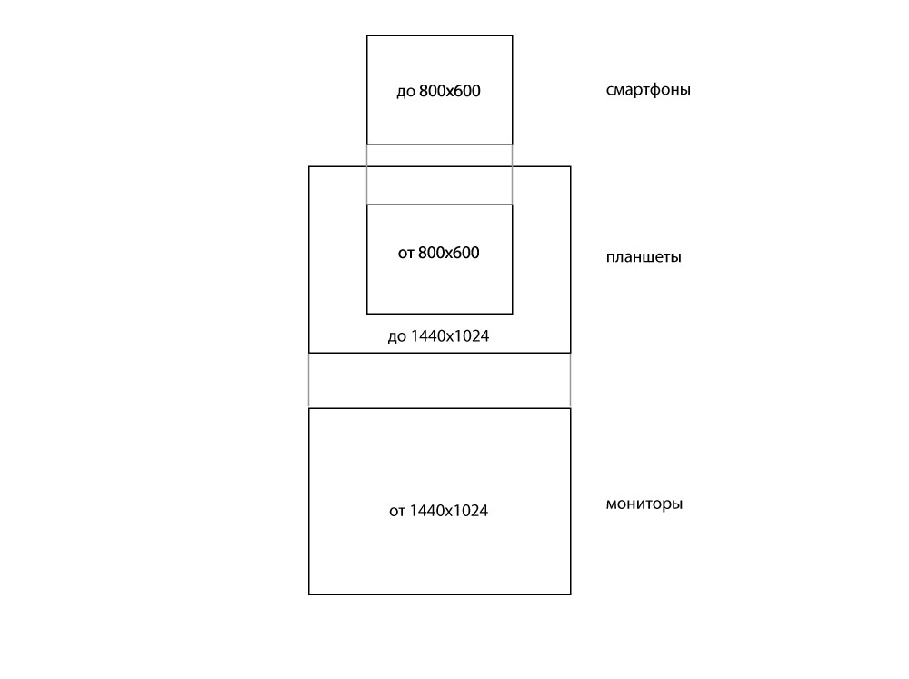
two or three versions of media queries - for smartphones, for tablets, for monitors
plus vertical and horizontal options
- that is, from four to six styles the 
difference is only in screen sizes and interface elements
and each application must be mobile first - that is, first touch interface
For mobile devices, you need to consider the size of the viewport, not the resolution.
Define useragent using javascript - Google is full of ready-made implementations.
If you are completely lazy, then here is matthewhudson.me/projects/device.js
And for the iPad in media, not 2560, the value needs to be set, but much less =)
stackoverflow.com/questions/4817029/whats-the-best...
function isTouchDevice() {
  return 'ontouchstart' in window // works on most browsers
      || navigator.maxTouchPoints;  // works on IE10/11 and Surface
}Didn't find what you were looking for?
Ask your questionAsk a Question
731 491 924 answers to any question