Answer the question
In order to leave comments, you need to log in
How to scale correctly for all monitors div?
We have some weather widget on the site, it is stored in a container with the following parameters.
<div style="position: fixed; width: 100% ; bottom: 0; left: 90%; right: 0; top: 0; z-index:100;">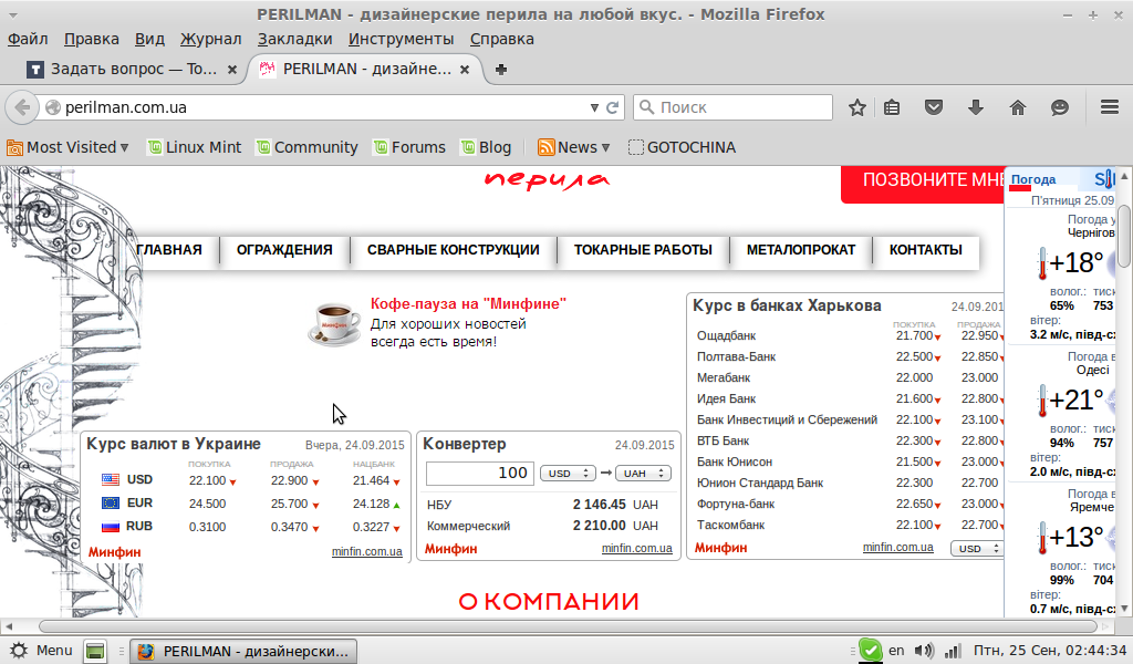 globally scaled down.
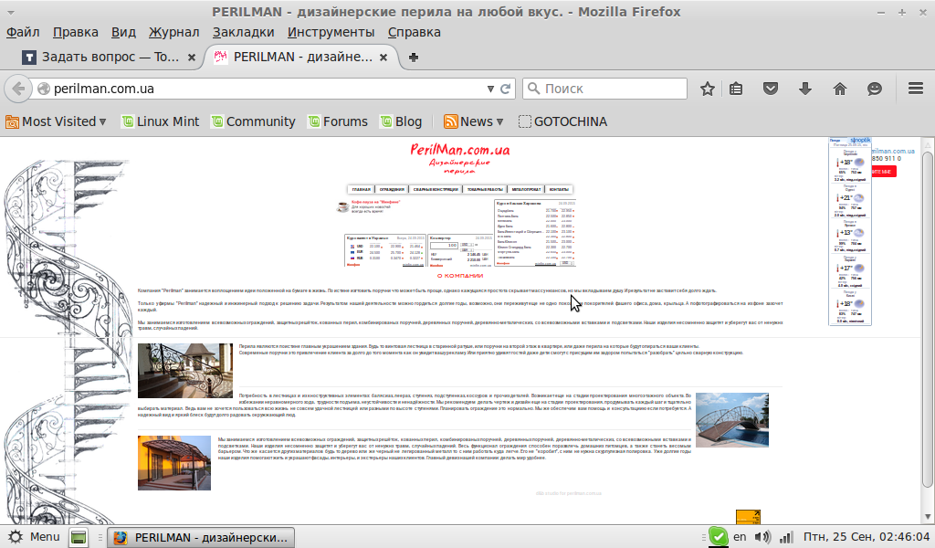
Answer the question
In order to leave comments, you need to log in
Faced a similar problem. I was also looking for a solution for a long time, I tried different options. In the end, I did it with display: table-row, display: table-cell;
Didn't find what you were looking for?
Ask your questionAsk a Question
731 491 924 answers to any question