Answer the question
In order to leave comments, you need to log in
How to responsively lay out a circle with text?
Good day. I'm laying out a block on Bootstrap 3. But I can't lay out a circle with text in the center that would be displayed properly on mobile devices.
<div class="col-md-6">
            <div class="cicle-slide">Lorem ipsum dolor sit amet, consectetur adipisicing elit. Tenetur incidunt provident odio. Corporis, eos sed laudantium quidem at autem deserunt molestias quasi sapiente quaerat est cumque iure, quam commodi libero. Facilis distinctio debitis dicta temporibus recusandae ipsa quas illo eum reiciendis id voluptates similique, corrupti sequi hic quam amet, cum placeat, quaerat quibusdam error pariatur provident. Velit libero, ipsa deserunt voluptates! Aliquam maiores quasi fugit porro neque voluptatem qui deserunt blanditiis, voluptatibus repudiandae, laboriosam. Qui, fugit est omnis nisi distinctio esse error assumenda ut enim velit labore, cumque earum </div>
          </div>
.cicle-slide {
background-color: #39B54A;
-moz-border-radius: 50%;
-webkit-border-radius: 50%;
border-radius: 50%;
text-align: center;
padding: 20px;
}
Answer the question
In order to leave comments, you need to log in
You should not try to make a mobile (for tablets and phones) one-to-one layout like for computers.
Perhaps, in your case, it would be more correct to rebuild this circle into another object, for example, into a rectangle at the bottom of the slider (a rectangle across the entire width of the slider and nailed to the footer).
Then everything will look right on your devices.
Or display blocks in a completely different form, for example, leave the slider as a slider, and move the circle completely under the slider down and display again in a rectangle.
Also, some blocks can be "sacrifice" in mobile layout.
Lots of options. Turn on your imagination :)
For clarity: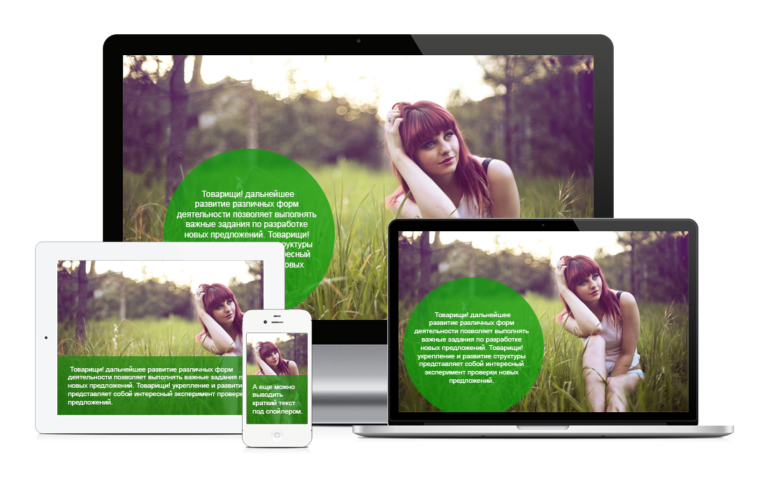
Didn't find what you were looking for?
Ask your questionAsk a Question
731 491 924 answers to any question