Answer the question
In order to leave comments, you need to log in
How to remove the background of the menu, after you move to the anchor?
Hello. I adapted the menu to my site, when you click on the desired component, it goes to the anchor link, but the transparent background of the menu remains, it turns out that nothing is visible. How to make it so that when you go to the anchor, the menu exits?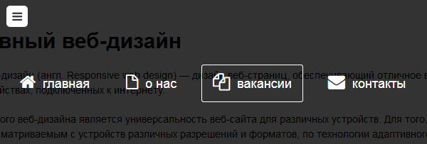
<nav id="menu">

                <input type="checkbox" id="toggle-nav"/>
                <label id="toggle-nav-label" for="toggle-nav"><i class="icon-reorder"></i></label>

                <div class="box">
                    <ul>
                        <li><a href="#"><i class="icon-home"></i> главная</a></li>
                        <li><a href="#"><i class="icon-file-alt"></i> о нас</a></li>
                        <li><a href="#"><i class="icon-copy"></i> вакансии</a></li>
                        <li><a href="#"><i class="icon-envelope"></i> контакты</a></li>
                    </ul>
                </div>

</nav>body {
font-family:Arial, sans-serif;
font-size: 12px;
}
a { text-decoration: none; }
a:hover { text-decoration: underline; }
li { list-style: none; }
.container { margin: 0px 20% 0px 20%; }
#head { margin-top: 20px; }
#menu .box {
position: fixed;
text-align: center;
overflow: hidden;
z-index: -1;
opacity: 0;
width: 100%;
height: 100%;
left: 0px;
top: 0px;
background: rgba(0,0,0,0.8);
-webkit-transition: all 0.3s ease-in-out;
-moz-transition: all 0.3s ease-in-out;
-o-transition: all 0.3s ease-in-out;
transition: all 0.3s ease-in-out;
}
#menu ul {
position: relative;
top: 20%;
-webkit-transform: scale(2);
-moz-transform: scale(2);
-ms-transform: scale(2);
transform: scale(2);
-webkit-transition: all 0.3s ease-in-out;
-moz-transition: all 0.3s ease-in-out;
-o-transition: all 0.3s ease-in-out;
transition: all 0.3s ease-in-out;
}
#menu li {
display: inline-block;
margin: 20px;
}
#menu li a {
border-radius: 3px;
padding: 15px;
border: 1px solid transparent;
text-decoration: none;
font-size: 18px;
color: #fff;
-webkit-transition: all 0.2s ease-in-out;
-moz-transition: all 0.2s ease-in-out;
-o-transition: all 0.2s ease-in-out;
transition: all 0.2s ease-in-out;
}
#menu li a:hover { border-color: #fff; }
#menu li a i {
margin-right: 5px;
font-size: 24px;
}
#toggle-nav-label {
color: rgba(0,0,0,0.5);
background: rgba(0,0,0,0.2);
text-align: center;
line-height: 30px;
font-size: 16px;
display: block;
cursor: pointer;
position: relative;
z-index: 500;
width: 30px;
height: 30px;
border-radius: 5px;
}
#toggle-nav { display: none; }
#toggle-nav:checked ~ .box {
opacity: 1;
z-index: 400;
}
#toggle-nav:checked ~ .box ul {
-webkit-transform: scale(1);
-moz-transform: scale(1);
-ms-transform: scale(1);
transform: scale(1);
}
#toggle-nav:checked ~ #toggle-nav-label {
background: #fff;
color: rgba(0,0,0,0.8);
}
#content { margin: 20px 0px 20px 0px; }
#content h1 {
margin-bottom: 20px;
font-size: 30px;
}
#content p {
font-size: 14px;
line-height: 150%;
margin-bottom: 20px;
}Answer the question
In order to leave comments, you need to log in
With such a layout, this is not possible without the use of JS. You need to either wait for support :has, or somehow move the links to the same level with the checkbox and use~
Didn't find what you were looking for?
Ask your questionAsk a Question
731 491 924 answers to any question