Answer the question
In order to leave comments, you need to log in
How to reduce line height in Inoreader with CSS?
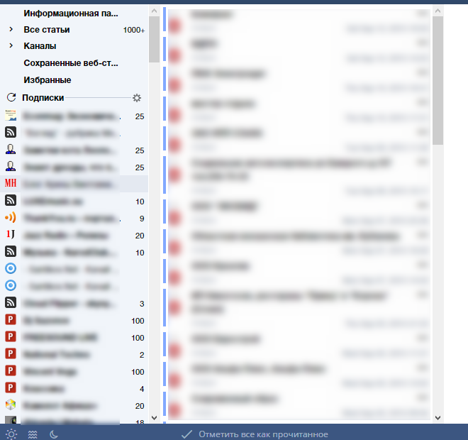
I must say right away that my knowledge on this topic is modest. I decided to clean up the Inoreader interface, found the styles of other users, but could not find two parameters. First of all, as you can see from the screenshot, there is a lot of empty space between the icons (and rows) in the ribbon tree (left column, Ultra density), but I definitely don’t understand what needs to be written in CSS in #tree_pane so that the icons are close to each other. Tried line-height, margin, and padding. All to no avail, alas. I tried to rummage through the source code of the page, but got confused. Judging by the CSS of the found styles, none of the style writers bothered with the height of the lines in the feed tree. 
Secondly, too much distance from the text of the article to the edges of the third column jars me. In the screenshot, however, the third column is cut off, but it doesn't matter.
Here are the styles:
https://userstyles.org/styles/90123/tiny-inoreader - increases the viewport (decrease the borders at the edges), but for some reason my article titles have moved out. To my shame, I did not understand what to copy from the code in order to reduce the spacing between the edge of the third column and the text of the articles.
https://userstyles.org/styles/88861/more-compact-i...
stylebot.me/styles/5071 - did not install
stylebot.me/styles/3028 - published 2 years ago, unlikely to fit today's interface
stylebot.me/styles/2776 - also an "old man"
Answer the question
In order to leave comments, you need to log in
Didn't find what you were looking for?
Ask your questionAsk a Question
731 491 924 answers to any question