Answer the question
In order to leave comments, you need to log in
How to put things in order in the drop-down menu of the mobile version?
Hello,
please help me to put things in order with the drop-down menu in the mobile version. I copied the site on WP, the menu and slider codes, and everything is fine in the desktop version, it doesn’t work with the mobile one:
1. Why does a billboard appear with a mobile menu on the main page, but not on other pages, if the styles are the same?
Here: 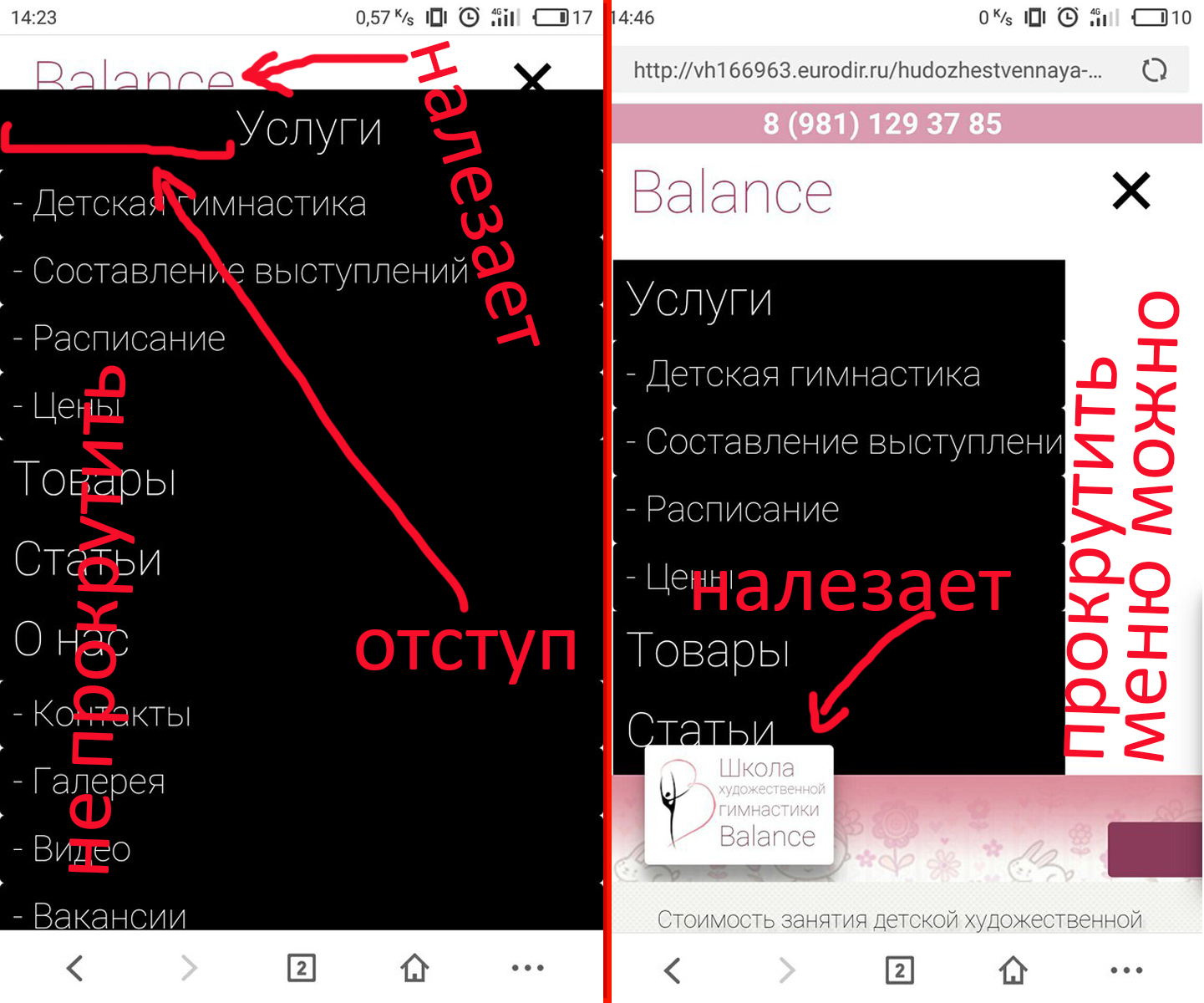
if you open the menu on the main page, it will expand to full screen and climb onto the logo. "Services" starts with an indent. On a normal page, there is no such thing: the height is set to 400 px, here I made the width 80% for the test, you can scroll, "Services" without indent, but the footer fits on the menu. Added overflow:scroll; in involved classes, changed z-index, but still. how to make an option on the main page like on a regular one, but so that the footer does not fit?
In general, how to make it prettier and more pleasant?
Answer the question
In order to leave comments, you need to log in
@media only screen and (max-width: 659px)
    men ul {
        float: none;
        clear: both; // add
    }
    #tmenu men a {
        color: #fff;
        padding: 8px;
        border-radius: 0; //add
    }

    men {
        padding: 10px;
        display: inline-block;
    }
}Didn't find what you were looking for?
Ask your questionAsk a Question
731 491 924 answers to any question