Answer the question
In order to leave comments, you need to log in
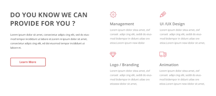
How to position elements with Flexbox?
Opposite the heading is a column with texts, it is necessary to make 2 columns from one column, as per the layout, I have already tried a lot of things, nothing works, I don’t know how to implement the task
Thank you in advance to all those who are not indifferent.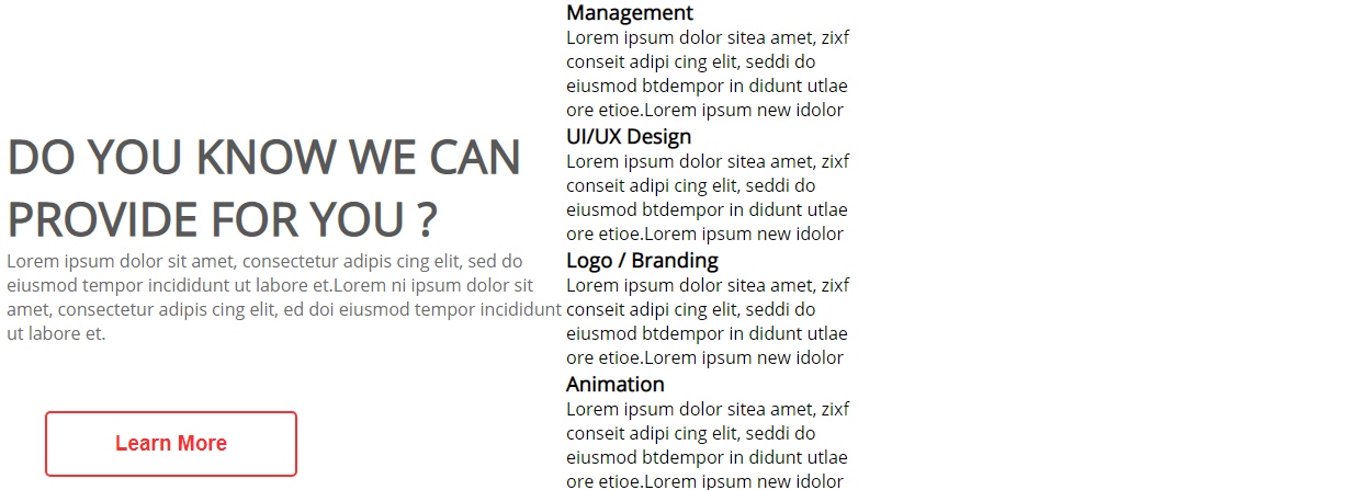
<section>
    <div class="provide-container">
      <div class="provide">
        <h1>DO YOU KNOW WE CAN <br> PROVIDE FOR YOU ?</h1>
        <p>Lorem ipsum dolor sit amet, consectetur adipis cing elit, sed do eiusmod tempor incididunt ut labore et.Lorem ni ipsum dolor sit amet, consectetur adipis cing elit, ed doi eiusmod tempor incididunt ut labore et.</p>

        <div class="button-2">
          <button>Learn More</button>
        </div>
      </div>

      <div class="management">
        <div class="management-1">
          <h3>Management</h3>
          <p>Lorem ipsum dolor sitea amet, zixf conseit  adipi cing elit, seddi do eiusmod btdempor in didunt utlae ore etioe.Lorem ipsum new idolor</p>
        </div>
        <div class="management-2">
          <h3>UI/UX Design</h3>
          <p>Lorem ipsum dolor sitea amet, zixf conseit  adipi cing elit, seddi do eiusmod btdempor in didunt utlae ore etioe.Lorem ipsum new idolor</p>
        </div>
        <div class="management-1">
          <h3>Logo / Branding</h3>
          <p>Lorem ipsum dolor sitea amet, zixf conseit  adipi cing elit, seddi do eiusmod btdempor in didunt utlae ore etioe.Lorem ipsum new idolor</p>
        </div>
        <div class="management-1">
          <h3>Animation</h3>
          <p>Lorem ipsum dolor sitea amet, zixf conseit  adipi cing elit, seddi do eiusmod btdempor in didunt utlae ore etioe.Lorem ipsum new idolor</p>
        </div>
      </div>
    </div>
  </section>
.provide {
padding-top: 115px;
}
.provide h1 {
font-size: 42px;
color: #585858;
padding-left: 10px;
}
.provide p {
padding-left: 10px;
width: 510px;
color: #6b6b6b;
}
.management {
width: 270px;
}
.provide-container {
display: flex;
flex-flow: row wrap;
}Answer the question
In order to leave comments, you need to log in
Didn't find what you were looking for?
Ask your questionAsk a Question
731 491 924 answers to any question