Answer the question
In order to leave comments, you need to log in
How to position elements using the flex property?
Hello, I need to make sure that the text is centered on the page, and the picture is to the left of it. Also, it is necessary that at a small screen resolution, the text is transferred to another line. I hope it will be better understood in the picture: I managed to do 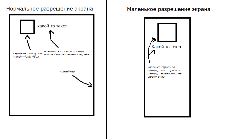 it with the help of a crutch
I managed to do it, only with the help of a crutch, but in my way, with a small screen resolution, an empty container interferes and the text is not centered at any resolution. Of course, this container can be removed using a media query and using the min-width function, but this is another crutch. I'm sure there is a much better and easier way
Answer the question
In order to leave comments, you need to log in
Didn't find what you were looking for?
Ask your questionAsk a Question
731 491 924 answers to any question