Answer the question
In order to leave comments, you need to log in
How to plot a dot plot for data from multiple series?
There is data: 10 buses that arrive at a stop at different times (horizontal) and, accordingly, at different time intervals (vertical).
In google spreadsheets, I was able to create a suitable graph, but only for one bus, and I have 10 of them, that is, other buses should have dots of a different color
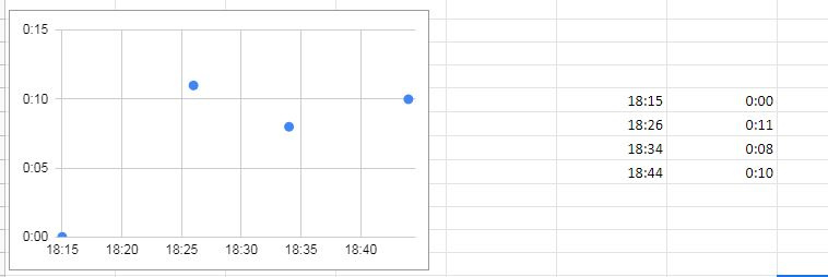
How can I do this?
That is, each point must be built separately according to 2 data (verticals and horizontals).
Answer the question
In order to leave comments, you need to log in
I like the Scatter Chart the most, but this task can be solved with other charts.
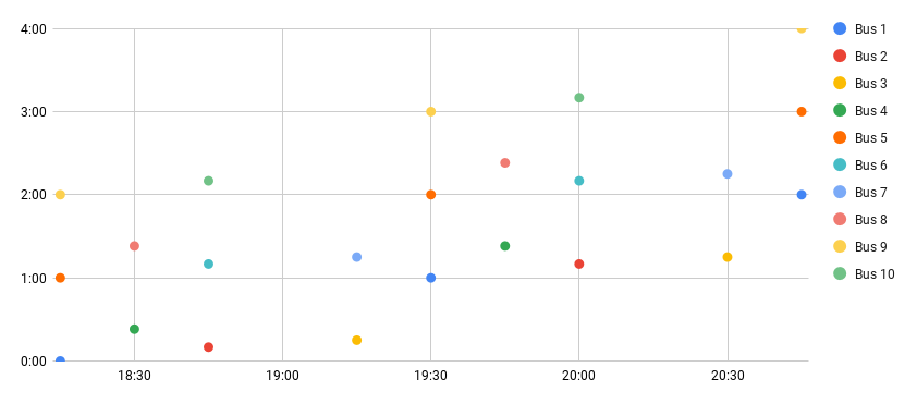
To define a series, you must multiply each value of the abscissa with a new set of ordinates. Those. for each bus you should have a new column (or row, depending on the orientation of the data).
Table Example
Didn't find what you were looking for?
Ask your questionAsk a Question
731 491 924 answers to any question