Answer the question
In order to leave comments, you need to log in
How to place the form in the center of the page horizontally and vertically?
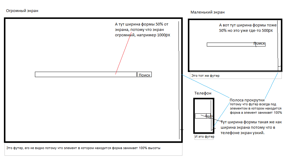
I found quite a few solutions on the net but I want something special... Firstly I want the element inside which the form is located to take 100% width and 100% height, secondly I want the form width to change depending on the width of the window (it should take 50% of the page width but be no less than the width of the window in the phone) and thirdly, I want this form to always be in the middle of the page (horizontally and vertically).
All the solutions I found on the net assume that the height of the element inside which the form is located is given in pixels, and I want the element to always occupy 100% of the page, whether it be a phone, tablet or a huge screen. Accordingly, if this is a huge screen, then the form should also be large (for example, 50% of the screen width), but if it is a phone, then the form should be the width of the screen (but vertically still be in the middle).
But the footer should always be at the bottom, under the element inside which there is a form. 
I'm sure there must be a ready-made solution on the net, but I can't find it. The page should have nothing but a search form and a footer BUT maybe in the future a menu will be added at the top (Bootstrap).
Answer the question
In order to leave comments, you need to log in
You make three nested divs with such display properties - table, table-row, table-cell (from parent to child). The last one, which is table-cell , is text-align: center and vertical-align: middle.
Didn't find what you were looking for?
Ask your questionAsk a Question
731 491 924 answers to any question