Answer the question
In order to leave comments, you need to log in
How to override NavBar and make hamburger menu on all resolutions?
Good afternoon.
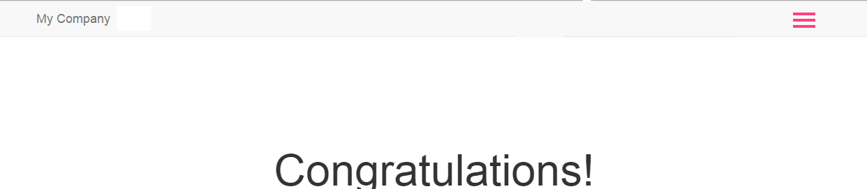
I would like to make a hamburger menu that is also shown on the big screen using the NavBar widget. In this case, the Nav widget should only be shown after clicking on the hamburger. 
In general, do it like on a mobile screen, but for all resolutions. But on the big screen, the button is pressed against the navbar-brand, and I would like it to be on the right (the border is limited by the container). 
I redefined the appearance of the button by creating
class CustomNavBar extends NavBar {

    public function init()
    {
        parent::init();
        Html::removeCssClass($this->options, 'navbar');
    }


      protected function renderToggleButton()
    {
        $bar1 = Html::tag('span', '', ['class' => 'nbar-top']);
         $bar2 = Html::tag('span', '', ['class' => 'nbar-middle']);
          $bar3 = Html::tag('span', '', ['class' => 'nbar-bottom']);
        $screenReader = "<span class=\"sr-only\">{$this->screenReaderToggleText}</span>";
        return Html::button("{$screenReader}\n{$bar1}\n{$bar2}\n{$bar3}", [
            'class' => 'navbar-toggle is-closed',
            'data-toggle' => 'collapse',
            'data-target' => "#{$this->containerOptions['id']}",
        ]);
    }
}.navbar-toggle {
z-index: 999;
display: block;
width: 32px;
height: 32px;
margin-right: 15px;
background: transparent;
border: none;
}
.navbar-toggle:hover,
.navbar-toggle:focus,
.navbar-toggle:active {
outline: none;
}
.navbar-toggle.is-closed,
.navbar-toggle.is-open {
-webkit-transition: all 0.5s ease;
-moz-transition: all 0.5s ease;
-o-transition: all 0.5s ease;
transition: all 0.5s ease;
}
.navbar-toggle.is-closed:before {
content: '';
display: block;
width: 100px;
font-size: 14px;
color: #fff;
line-height: 32px;
text-align: center;
opacity: 0;
-webkit-transform: translate3d(0,0,0);
-webkit-transition: all 0.35s ease-in-out;
}
.navbar-toggle.is-closed:hover:before {
opacity: 1;
display: block;
-webkit-transform: translate3d(-100px,0,0);
-webkit-transition: all 0.35s ease-in-out;
}
.navbar-toggle.is-closed .nbar-top,
.navbar-toggle.is-closed .nbar-middle,
.navbar-toggle.is-closed .nbar-bottom,
.navbar-toggle.is-open .nbar-top,
.navbar-toggle.is-open .nbar-middle,
.navbar-toggle.is-open .nbar-bottom {
position: absolute;
left: 0;
height: 4px;
width: 100%;
}
.navbar-toggle.is-closed .nbar-top,
.navbar-toggle.is-closed .nbar-middle,
.navbar-toggle.is-closed .nbar-bottom {
background-color: #ff4081;
}
.navbar-toggle.is-closed .nbar-top {
top: 5px;
-webkit-transition: all 0.35s ease-in-out;
}
.navbar-toggle.is-closed .nbar-middle {
top: 50%;
margin-top: -2px;
}
.navbar-toggle.is-closed .nbar-bottom {
bottom: 5px;
-webkit-transition: all 0.35s ease-in-out;
}
.navbar-toggle.is-closed:hover .nbar-top {
top: 0;
-webkit-transition: all 0.35s ease-in-out;
}
.navbar-toggle.is-closed:hover .nbar-bottom {
bottom: 0;
-webkit-transition: all 0.35s ease-in-out;
}
/*.navbar-toggle.is-open {
left: auto;
right: 220px;
}*/
.navbar-toggle.is-open .nbar-top,
.navbar-toggle.is-open .nbar-middle,
.navbar-toggle.is-open .nbar-bottom {
background-color: #ff4081;
}
.navbar-toggle.is-open .nbar-top,
.navbar-toggle.is-open .nbar-bottom {
top: 50%;
margin-top: -2px;
}
.navbar-toggle.is-open .nbar-top {
-webkit-transform: rotate(45deg);
-webkit-transition: -webkit-transform 0.2s cubic-bezier(.73,1,.28,.08);
}
.navbar-toggle.is-open .nbar-middle {
display: none;
}
.navbar-toggle.is-open .nbar-bottom {
-webkit-transform: rotate(-45deg);
-webkit-transition: -webkit-transform 0.2s cubic-bezier(.73,1,.28,.08);
}
.navbar-toggle.is-open:before {
content: '';
display: block;
width: 100px;
font-size: 14px;
color: #fff;
line-height: 32px;
text-align: center;
opacity: 0;
-webkit-transform: translate3d(0,0,0);
-webkit-transition: all 0.35s ease-in-out;
}
.navbar-toggle.is-open:hover:before {
opacity: 1;
display: block;
-webkit-transform: translate3d(-100px,0,0);
-webkit-transition: all 0.35s ease-in-out;
} UPDATED
.navbar-header {
        float: none;
    }
    .navbar-toggle {
        display: block;
    }
    .navbar-collapse {
        border-top: 1px solid transparent;
        box-shadow: inset 0 1px 0 rgba(255,255,255,0.1);
    }
    .navbar-collapse.collapse {
        display: none!important;
    }
    .navbar-nav {
        float: none!important;
        margin: 7.5px -15px;
    }
    .navbar-nav>li {
        float: none;
    }
    .navbar-nav>li>a {
        padding-top: 10px;
        padding-bottom: 10px;
}Answer the question
In order to leave comments, you need to log in
In bootstrap, hiding and displaying menus at different resolutions is done using css media queries, so any changes are css overrides, according to your needs.
getbootstrap.com/components/#navbar
Didn't find what you were looking for?
Ask your questionAsk a Question
731 491 924 answers to any question