Answer the question
In order to leave comments, you need to log in
How to make the background display full width and so that the block is displayed correctly?
Hello! It is necessary that the background-color is displayed for the entire width of the screen, and also that the navigation block is below the image block.
<header class="header">
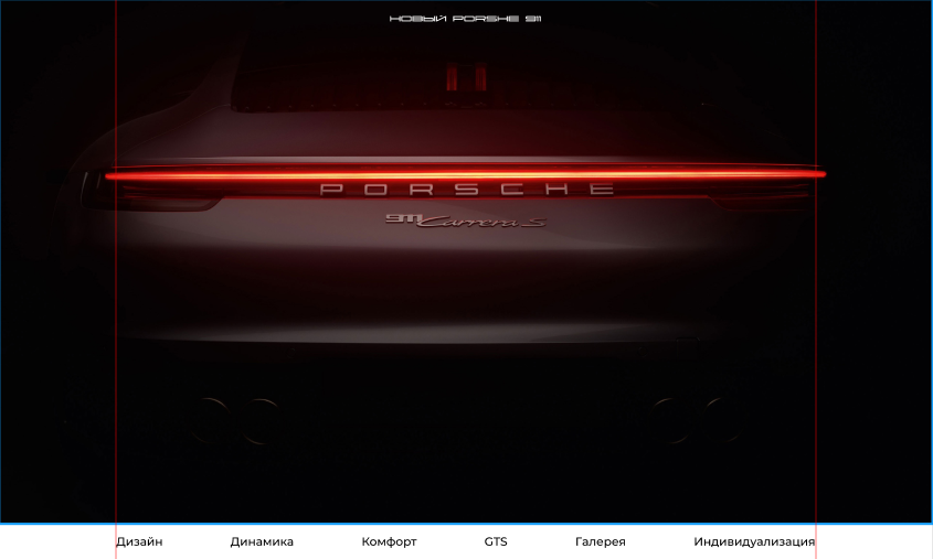
<h1>Новый Porshe 911</h1>
<video controls muted playsinline autoplay>
<source src="video/Home.mp4" type="video/mp4">
</video>
</header>
<div class="wrapper">
<div class="page-light">
<div class="nav">
<li class="nav-item"><a class="nav-link" href="">Дизайн</a></li>
<li class="nav-item"><a class="nav-link" href="">Динамика</a></li>
<li class="nav-item"><a class="nav-link" href="">Комфорт</a></li>
<li class="nav-item"><a class="nav-link" href="">GTS</a></li>
<li class="nav-item"><a class="nav-link" href="">Галерея</a></li>
<li class="nav-item"><a class="nav-link" href="">Индивидуализация</a></li>
</div>
</div>
</div>body {
font-family: 'Montserrat', sans-serif;
margin: 0 auto;
padding: 0 auto;
}
.page {
&-dark {
background-color: black;
}
&-light {
background-color: white;
}
}
.wrapper {
max-width: 1440px;
margin: 0 auto;
}
.header {
font-family: 'Porsche', serif;
h1 {
letter-spacing: 5px;
margin-top: 30px;
text-align: center;
color: #fff;
font-size: 18px;
}
video {
position: absolute;
z-index: -1;
top: 0;
left: 0;
width: 100%;
height: 100%;
object-fit: cover;
object-position: center;
}
video::-webkit-media-controls {
display:none !important;
}
}
.nav {
display: flex;
justify-content: space-between;
&-item {
padding: 20px 0px;
margin-right: 139px;
list-style: none;
font-weight: 500;
font-size: 24px;
}
&-link {
color: black;
text-decoration: none;
}
}Answer the question
In order to leave comments, you need to log in
Didn't find what you were looking for?
Ask your questionAsk a Question
731 491 924 answers to any question