Answer the question
In order to leave comments, you need to log in
How to make matplotlib not compress the plot on the x-axis with the date?
Good afternoon, I have an array:
Time OU d6
0 2021-04-01 08:00:00 18.09250 2.653730
1 2021-04-01 08:40:00 17.83270 2.652515
2 2021-04-01 09:20:00 17.76485 2017 2017 2017 2017 2017
2017 -04-01 10:00:00 17.78840 2.779075
4 2021-04-01 10:40:00 16.43675 2.252920 When I
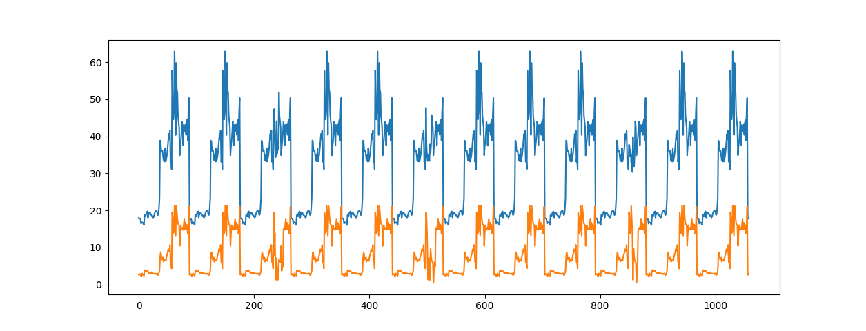
build a chart without a date, it looks normal:
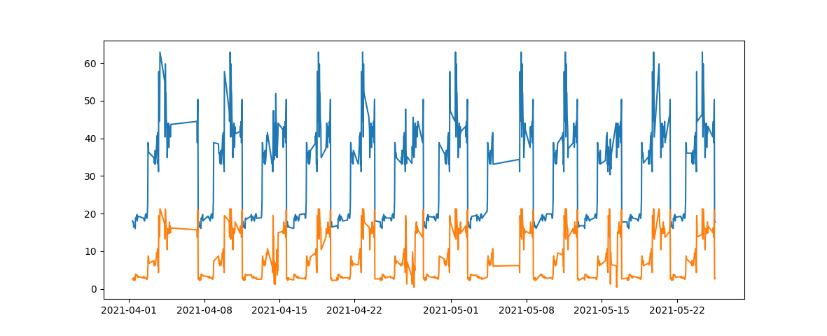
But when I substitute the date, the chart somehow shrinks, losing some points.
Please tell me how to make the graph look like on the first screen but with dates.
I convert the date like this:
file_excel = pd.read_excel('~\Dataset2WithTime.xlsx', usecols=[0, 1, 2])
    print(file_excel.head())

    Time = [datetime.fromisoformat(str(i)) for i in file_excel.iloc[:, 0]]
    plt.plot(Time, file_excel.iloc[:, 1])
    plt.plot(Time, file_excel.iloc[:, 2])
plt.show()Answer the question
In order to leave comments, you need to log in
What does "looked like" mean?
On the first chart, the pattern is built by ticks.
On the second - by dates.
How you went from the second to the first or vice versa - this is not known to us. But Matplotplb considers that the distance between two objects is equidistant. And it doesn't matter to him - how - in ticks or in dates - you slip this data to him. Therefore, it is not Matplotlib that needs to be dealt with here, but how you made the transition between different moments of fixing values.
Show your dataset roughly between 2021-04-05 and 2021-04-07 and everything will become clear.
Didn't find what you were looking for?
Ask your questionAsk a Question
731 491 924 answers to any question