Answer the question
In order to leave comments, you need to log in
How to make dynamic scale depending on screen ratio?
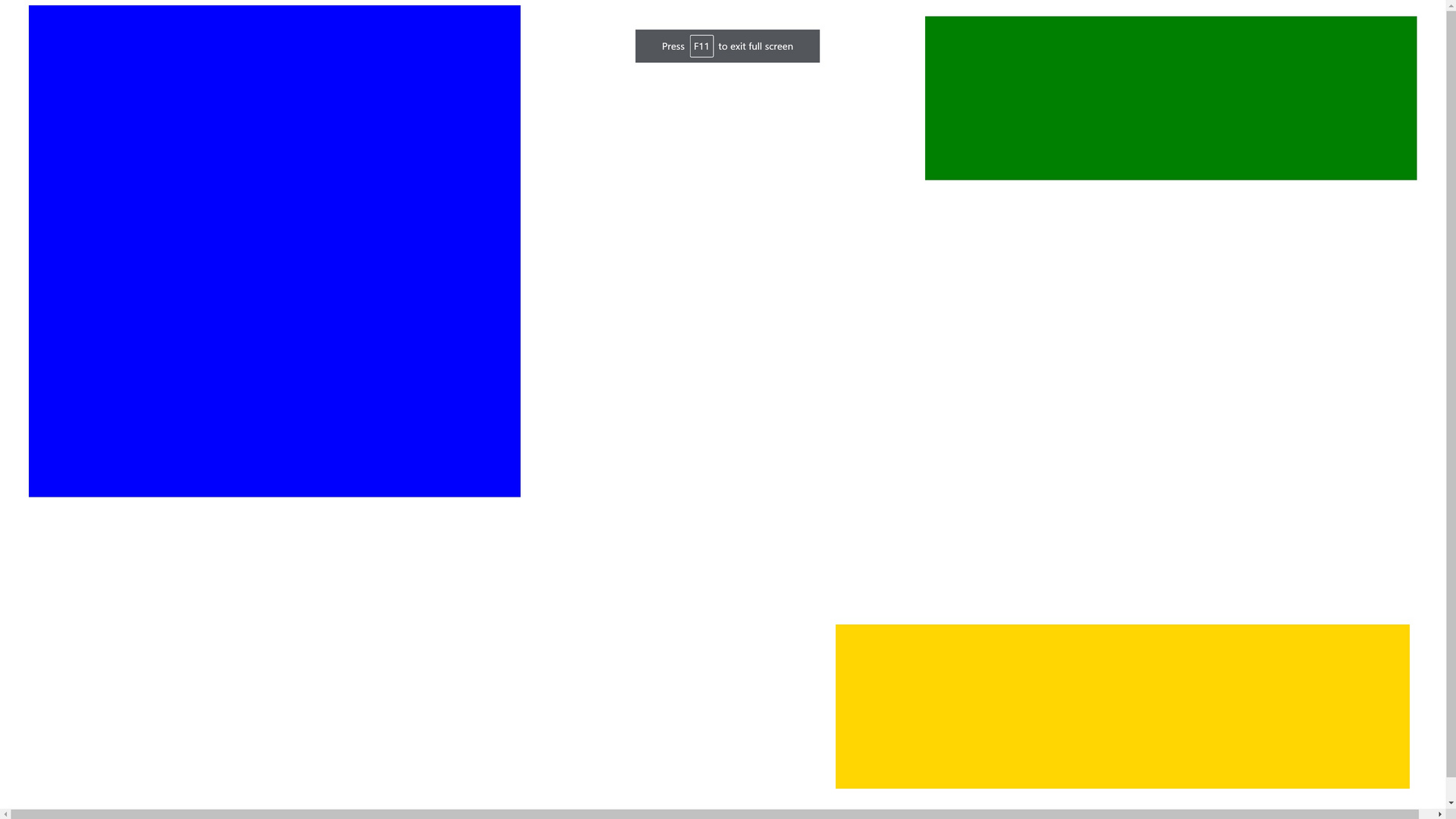
Hello, in order to maintain the proportionality of the elements (fluid layout), I make all sizes in vmin (font/square sizes, etc.) However, I need the elements to decrease in the case of square screens (to prevent forging) how can I do this...
Sample code
<div class="main">
    <div class="auth"></div>
    <div class="table" ></div>
    <div class="news" ></div>
</div>


<style>
.main {
  width: 100vw;
  height: 100vh;
  }

  .auth {
    width: 60vmin;
  height: 60vmin;
  background: blue;
  position: absolute;
  left: 2%;
  right : 2%;
  }
  .table {
      width: 60vmin;
  height: 20vmin;
  background: green;
    position: absolute;
    right: 2%;
    top: 2%;
  }
  .news {
        width: 70vmin;
  height: 20vmin;
  background: gold;
    position: absolute;
    right: 2.5%;
    bottom: 2.5%;
  }

</style>

@mixin fontSuperSize($number){
  @media (min-aspect-ratio: 2/1) {
      font-size: $number * 2vh;
  }
  @media (max-aspect-ratio: 2/1) {
      font-size: $number * 1vw;
  }
}Answer the question
In order to leave comments, you need to log in
Bootstrap-vue has a `b-aspect` component that implements similar behavior - you can peek at them)
https://bootstrap-vue.org/docs/components/aspect
Didn't find what you were looking for?
Ask your questionAsk a Question
731 491 924 answers to any question