Answer the question
In order to leave comments, you need to log in
How to make a slide-out menu on the left/right?
Hey!
I need to make a menu, like here www.kakao.com/main The nuance

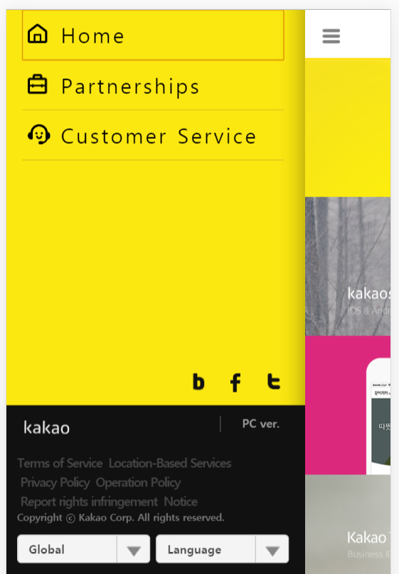

of this task is that the bootstrap is used, and if the user is from the desktop, these menus are opened in the same form, and the buttons that open them are hidden. From a mobile phone / tablet - they (the menus) are not visible, there are buttons - which should open the corresponding menu.
How to implement it?
Answer the question
In order to leave comments, you need to log in
Normal check:
<nav id="menu">
<li>меню</li>
<li>меню</li>
<li>меню</li>
</nav>
<nav id="mobile-menu">
<li>меню</li>
<li>меню</li>
<li>меню</li>
</nav>
#mobile-menu {
display:none;
}var dispayWidth=$(window).width();
if (dispayWidth < 768) {
$("#mobile-menu").css("display", "block");
$("#menu").css("display", "none");
}
else {
$("#mobile-menu").css("display", "none");
$("#menu").css("display", "block");
}Didn't find what you were looking for?
Ask your questionAsk a Question
731 491 924 answers to any question