Answer the question
In order to leave comments, you need to log in
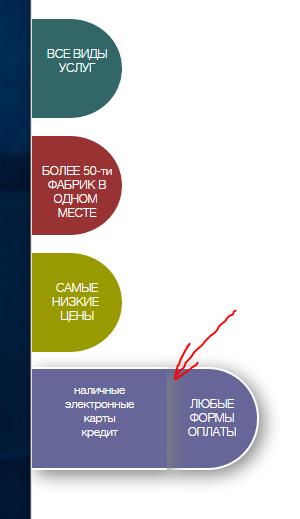
How to make a shadow not on all sides?
I made buttons on CSS + HTML now I don’t know how to deal with shadows.
Here is the code for the last banner:
<div id="button04"><br><br>ЛЮБЫЕ ФОРМЫ ОПЛАТЫ
    <div id="s_panel04">
      <p> <br>наличные<br>электронные<br>карты<br>кредит</p>
    </div>
  </div>
#button04 {
position: fixed;
top: 610px;
left: 0;
background: #666699;
width: 100px;
height: 110px;
color: #fff;
border-top:3px solid white;
border-bottom:3px solid white;
border-right:3px solid white;
box-shadow:5px 5px 30px gray;
text-align: center;
-webkit-transition-duration: 0.3s;
-moz-transition-duration: 0.3s;
-o-transition-duration: 0.3s;
transition-duration: 0.3s;
-webkit-border-radius: 0 5px 5px 0;
-moz-border-radius: 0 5px 5px 0;
border-radius: 0 60px 60px 0;
}
#s_panel04 {
position: fixed;
top: 610px;
left: -150px;
background: #666699;
width: 150px;
height: 110px;
box-shadow:5px 5px 30px gray;
border-top:3px solid white;
border-bottom:3px solid white;
-webkit-transition-duration: 0.3s;
-moz-transition-duration: 0.3s;
-o-transition-duration: 0.3s;
transition-duration: 0.3s;
}
#button04:hover {
left: 150px;
}
#button04:hover #s_panel04 {
left: 0;
}
Answer the question
In order to leave comments, you need to log in
leave shadows only for the button and padding the button for the width of the panel
resp. move it to the left by the same width
and remove the shadows and background from the panel altogether
, something like this jsfiddle.net/nrao4bub
update : oh, markup was added - then like this jsfiddle.net/nrao4bub/1
The z-index for the left box is larger than the right box to cover the shadow.
And a little higher there was advice to make padding, also an option.
Didn't find what you were looking for?
Ask your questionAsk a Question
731 491 924 answers to any question