Answer the question
In order to leave comments, you need to log in
How to make a responsive Z-pattern on Bootstrap 4?
It took me a hard time to type up my own new site on Bootstrap 4 instead of the 3rd one, which I have known well for several years. As it happens in such situations - instead of a quick swoop with a sword drawn, you are forced to spend up to 90% of the time on a Google project and studying the documentation for a new product for yourself.
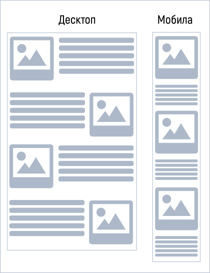
Here's the z-pattern, for those who don't understand, in 2 versions (some call it "apple-like"))): 
Here's a really working section on Bootstrap 3:
<div class="row">
  <div class="col-md-5 col-sm-5">
    <img src="" alt="" class="img-responsive">
  </div>
  <div class="col-md-7 col-sm-7">
    <p>Текстовка</p>
  </div>
</div>
<hr />
<div class="row">
  <div class="col-md-5 col-sm-5 col-md-push-7 col-sm-push-7 col-xs-push-0">
    <img src="" alt="" class="img-responsive">
  </div>
  <div class="col-md-7 col-sm-7 col-md-pull-5 col-sm-pull-5 col-xs-pull-0">
    <p>Текстовка</p>
  </div>
</div>Answer the question
In order to leave comments, you need to log in
Have a look here https://getbootstrap.com/docs/4.0/examples/carousel/ featurette section. Are you looking for this?
And it makes no sense to put the same cm / md. You can set the minimum screen and move from it. For example, count-lg-3 count-md-12. In general, bootstrap is an evil that destroys skills)
Didn't find what you were looking for?
Ask your questionAsk a Question
731 491 924 answers to any question