Answer the question
In order to leave comments, you need to log in
How to make a responsive image using Bootstrap?
I have two blocks col-lg-6:
<div class="container">
            <div class="row">
                <div class="col-lg-6 mt-5">
                    <p>Text</p>
                </div>
                <div class="col-lg-6 mt-5 illustration_bg">
                    <img src="img/krolik_paczki.svg" alt="logo">
                </div>
            </div>
        </div>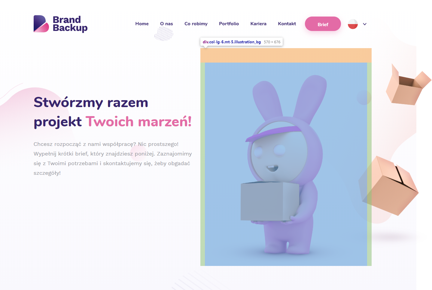
Answer the question
In order to leave comments, you need to log in
Didn't find what you were looking for?
Ask your questionAsk a Question
731 491 924 answers to any question