Answer the question
In order to leave comments, you need to log in
How to improve the main page of the terminal?
So I decided to file a normal design for the terminal of one client (taxi service). I thought about how to do it right and this is what happened: 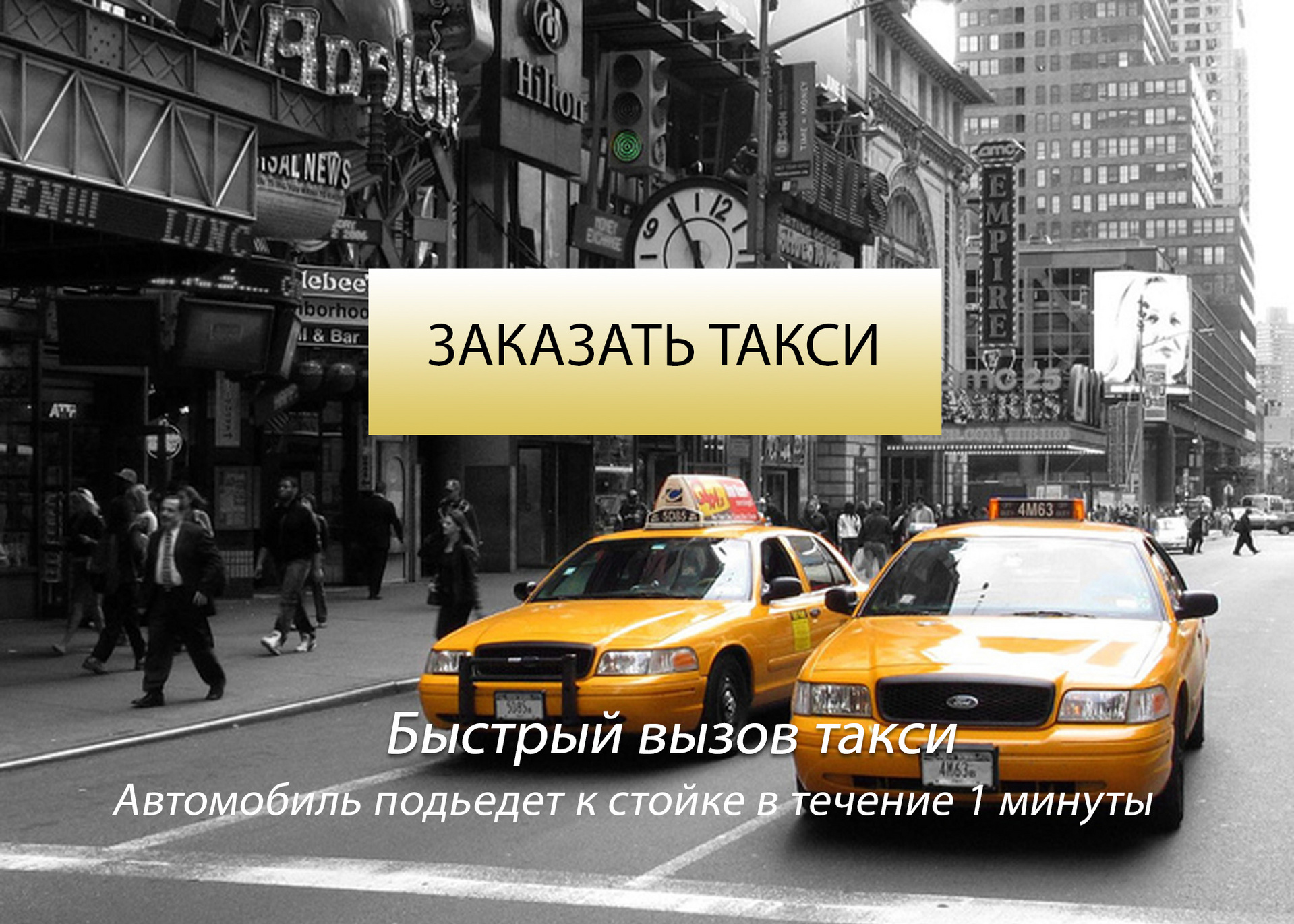
The task is this -
1. make it so that it is immediately clear that the terminal is for quickly calling a taxi for airport customers.
2. Display basic information on the main screen (as easy to read as possible and to make it clear what services we provide).
The essence of the services is that the taxi is already at the airport in the parking lot and arrives in 1 minute.
Answer the question
In order to leave comments, you need to log in
And what happens when you click on the "Order a Taxi" button?
Fast delivery is a good thing. What about prices? A person should roughly understand the prices in order to confidently press the button, and not think, “It’s probably expensive here, since there is even a terminal
.
Then the question is "What kind of car will come? Maybe it's a Zhiguli?"
I would write the text on the left in large print, in black and white "Quick taxi call"
And on the right
- Delivery in 1 minute
- to the city from 900 rubles.
- New cars (Toyota Camry, Hyunday Sonata and similar)
Below the yellow button "Order a taxi"
To be honest, not really, The buttons are not visible, it looks like a design element.
I propose a white banner, with an outline silhouette of the car, the inscription TAXI is mandatory, and a dial with a red sector and the inscription below
"Wait 1 minute ..."
(all on a white background)
1. Circle timer (5/8 of the area of the width)
2. Above the center (inside the circle of the timer): black and yellow checkers (almost the entire upper half).
3. Under the center (inside the timer circle): the inscription: "Taxi delivery in 1 minute!" (almost the entire lower half)
4. Under the timer, a little smaller, but so that it is easy to read near: "We will give a taxi to this counter in one minute immediately after the order."
5. Button - yellow, round, with checkers around the perimeter of the circle and in the very center of the timer (where the axis of rotation of the arrows, usually) and on it the inscription ORDER A TAXI (the words are under each other, "taxi" is a little smaller)
Didn't find what you were looking for?
Ask your questionAsk a Question
731 491 924 answers to any question