Answer the question
In order to leave comments, you need to log in
How to hide the menu when adapting?
I have this menu:
https://codepen.io/anastasia_pat/pen/ExPmWXp
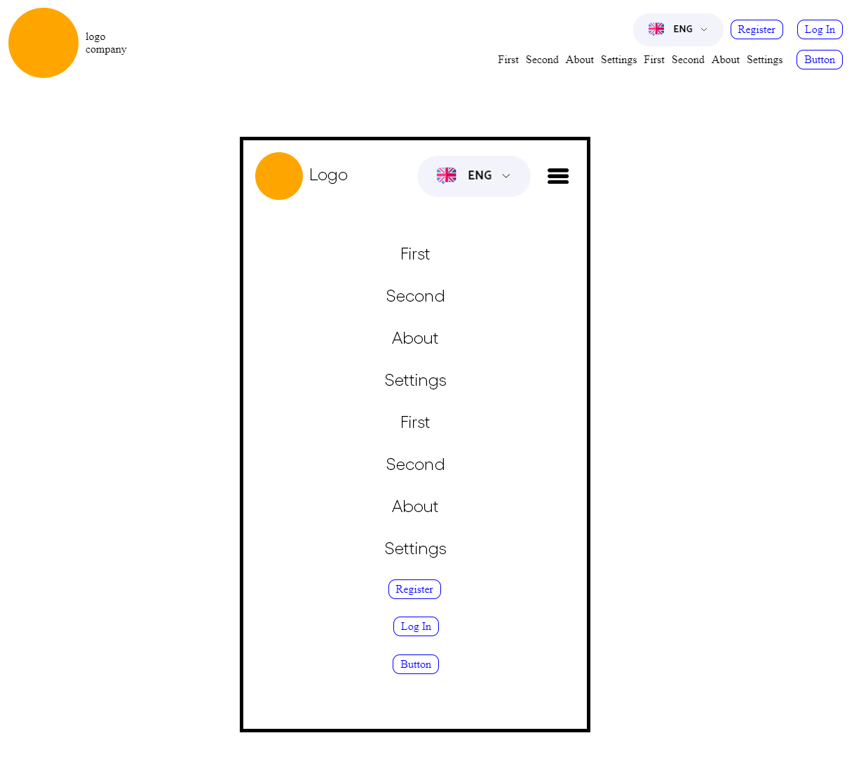
Please tell me how to hide all buttons and links in a separate div when the screen is reduced (width less than 1000px). Leave only the logo, language and button, when pressed, this menu will open in full screen.

Answer the question
In order to leave comments, you need to log in
In an example on the person a nesting problem. Purely theoretically, you can arrange everything in one line on flex, which can be sorted for a specific display on the desktop and on the phone (the order of the logo, language selection, and everything else).
Or all this joy in the form of navigation and buttons is rigidly positioned on the desktop so that there is a language selection button on top of them. So that in the future it would be possible to simply show the entire block on a mobile phone.
Edge - to duplicate something. For example, the same language selection should be shown outside the navigation block on the phone, and inside the order block on the desktop). Duplicate it will be cheaper than the entire navigation.
Well, if a thread of a JS framework is available at hand, then you can absolutely draw different components (generate DOM) depending on the resolution.
const item = document.getElementById("menu");
if(document.documentElement.clientWidth < 1000) {
    item.style.display = "none";
}Didn't find what you were looking for?
Ask your questionAsk a Question
731 491 924 answers to any question