Answer the question
In order to leave comments, you need to log in
How to fix the visual display of the fields of the Simple module on the mobile version?
Hello! Please tell me in which file and what needs to be written so that on all devices with a screen extension of 768px and below, the fields are displayed under the name, and not as it is now, to the right of the field name?
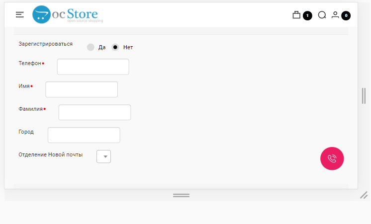
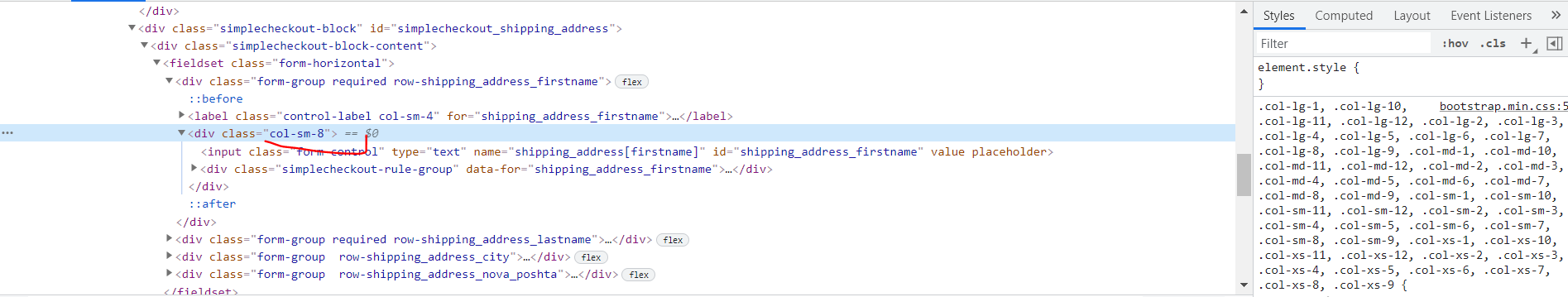
If I understand correctly, then the col-sm-8 class in the bostrap.min.css file is responsible for the visual.
Or do I need to edit the style.css file directly from the Simple module?
Site https://cosmozoo.com.ua
I would be very grateful for any help or hint!
Answer the question
In order to leave comments, you need to log in
In your case, the problem can be solved by adding this style:
@media (max-width:767px) {
.simple-content .form-group {
    display: block !important;
}
}Didn't find what you were looking for?
Ask your questionAsk a Question
731 491 924 answers to any question