Answer the question
In order to leave comments, you need to log in
How to fix a bug in bootstrap when an empty space is formed between columns equal to the width of the column?
With this code:
<div class="container">
  <div class="row">
    <div class="col-md-2 col-sm-4 col-xs-6">1</div>
    <div class="col-md-2 col-sm-4 col-xs-6">2</div>
    <div class="col-md-2 col-sm-4 col-xs-6">3</div>
    <div class="col-md-2 col-sm-4 col-xs-6">4</div>
    <div class="col-md-2 col-sm-4 col-xs-6">5</div>
    <div class="col-md-2 col-sm-4 col-xs-6">6</div>
  </div>
</div>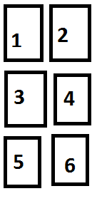 But in reality it often turns out like this:
 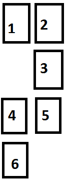 How to remove this bug?
Answer the question
In order to leave comments, you need to log in
Well, this is the usual behavior of float:left for different element heights. For mobile, the following code may help
@media (max-width: 767px) {
  .col-xs-6:nth-child(2n+1) {
      clear: left;
  }
}If you use strictly the bootstrap tools specifically designed for this, then use an additional block with the .clearfix class ( getbootstrap.com/css/#helper-classes-clearfix )
which is displayed only on certain resolutions - those where the problem is observed. See Responsive utilities ( getbootstrap.com/css/#responsive-utilities )
Didn't find what you were looking for?
Ask your questionAsk a Question
731 491 924 answers to any question