Answer the question
In order to leave comments, you need to log in
How to find out and fix the cause of the disappearance of the button when changing the screen width?
The button appears only when a certain screen width is set. 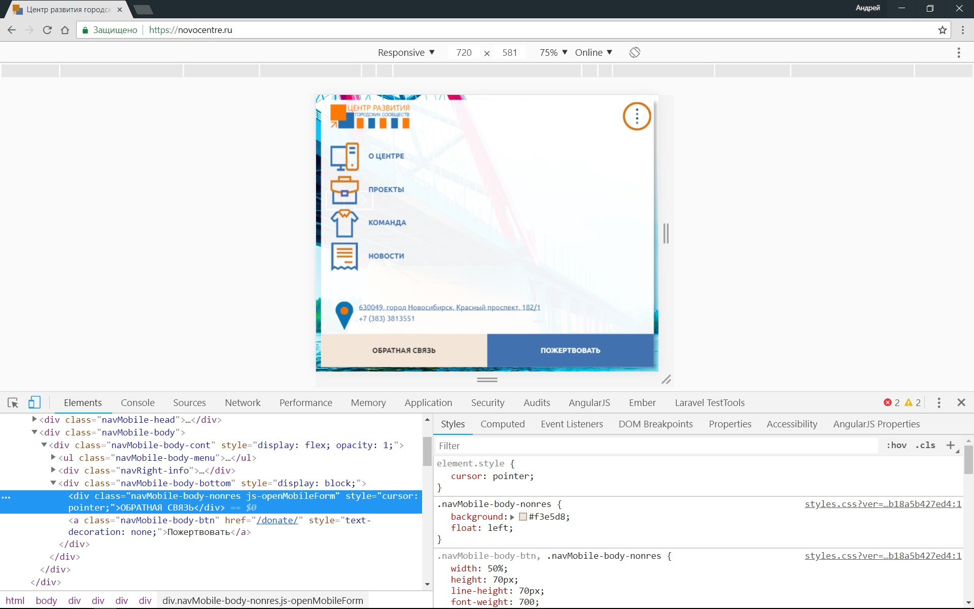
The block with elements has defined - but I don’t understand what style is responsible for displaying the button.
And how to find the style file itself - /wp-content/themes/novocentre/css/styles.css?ver=075aea8db6f2b78682bcb18a5b427ed4? What is ver - What is it?
Answer the question
In order to leave comments, you need to log in
Good afternoon!
The "feedback" button on the screen is an element
It is in the parent block
which is only displayed on screen up to 800px
@media screen and (max-width: 800px)
.navMobile {
    display: block;
}@media screen and (max-width: 800px)
.navWrap {
display: none;
}If it disappears or appears at a certain width, then look for styles in media queries
on the left in the screenshot you hovered over the element. Its parent (navMobile-body-bottom) has display: block in its style attribute. Most likely, display: none is set through the script
And how to find the file with stylesclick on style.css?ver=_b.... which is on the right.
Hello. Find the screen width at which the button is visible. Styles are usually defined in the style.css file, and if they are visible at a certain width, then they are added as media queries.
In the browser console look for something media ....
For example, media (min-width:768px) AND (max-width:1024px) {} etc. respectively, the minimum and maximum width will indicate at what resolution to display this element. And on ver... you can ignore. The stylesheet itself is in the theme folder.
Didn't find what you were looking for?
Ask your questionAsk a Question
731 491 924 answers to any question