Answer the question
In order to leave comments, you need to log in
How to do adaptive layout when there are 2 pictures?
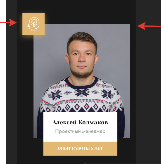
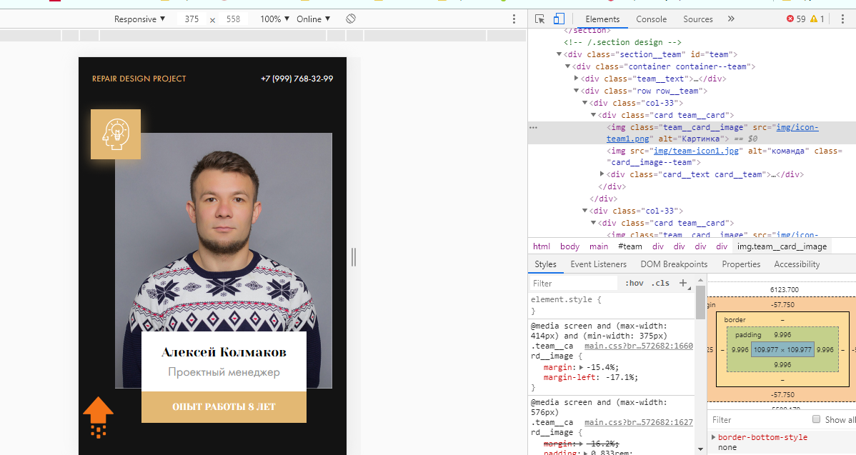
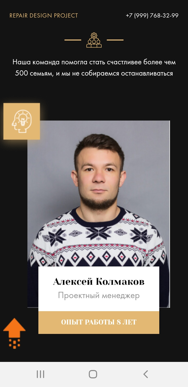
Hello guys. I have a problem, help me solve it, with advice, whatever. I designed the layout, we have 2 pictures, one photo and with position: absolute the second picture. , everything seems to be normal on the laptop, I go from the phone, everything is crooked, I can’t defeat her for the life of me. Yes, even if I somehow catch the dimensions from MY phone, where is the guarantee that it will be good from others, or from a tablet? Tell me how to prescribe sizes or indents, maybe I'm doing something wrong ??  This is the original.

Answer the question
In order to leave comments, you need to log in
You need to position the icon relative to the photo. To do this, use position: relative.
Those. Position the container in the center. margin: 0 auto;
Inside it is a div for which you set position: relative
Already in this div you place your photo and icon. Position the icon absolutely
Didn't find what you were looking for?
Ask your questionAsk a Question
731 491 924 answers to any question