Answer the question
In order to leave comments, you need to log in
How to create a multifunctional and correct navigation in the application?
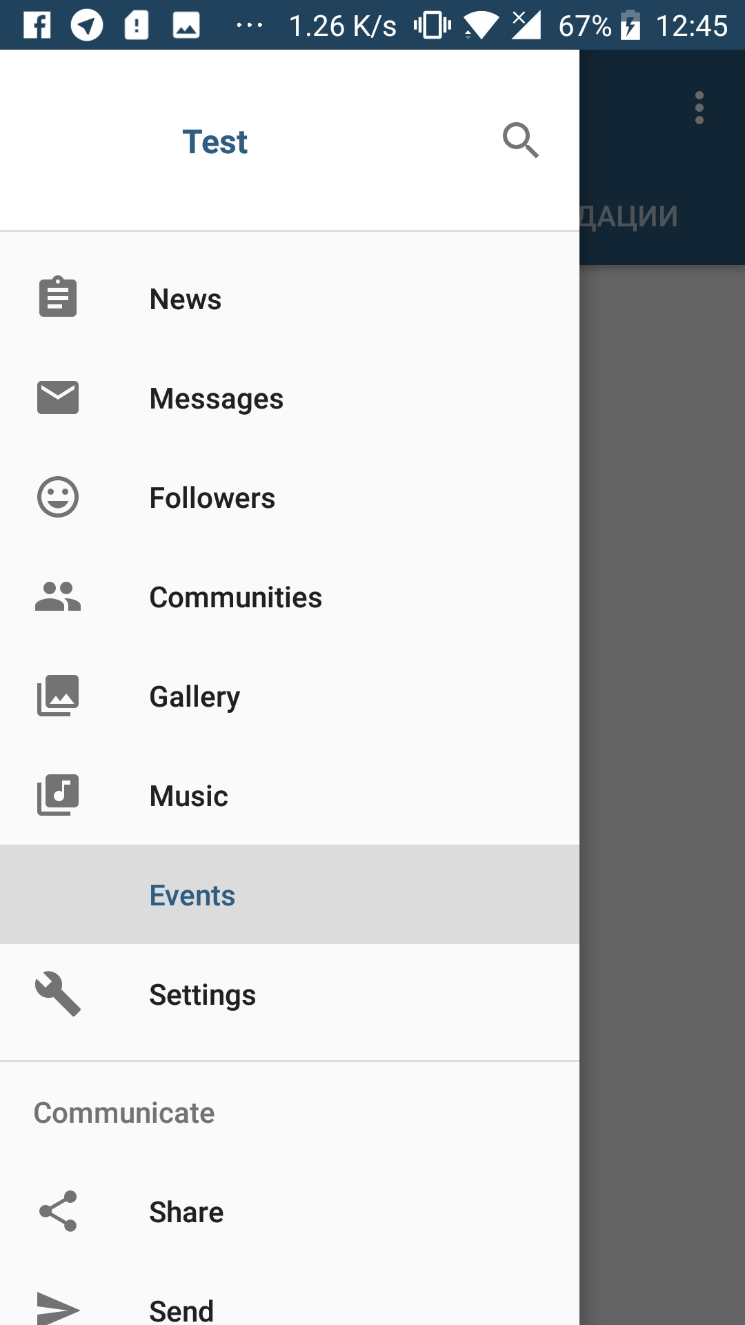
I created a simple Navigation Drawer in the application with all the fragments (shutter on the left) and a Bottom Navigation View, in which the five most used fragments from the simple Navigation Drawer are placed. Is it right to do so? Or can something be replaced? I just want some fragments from the Navigation Drawer to be in quick access. The photo is just an example.


Answer the question
In order to leave comments, you need to log in
That's right - this is the most simple and user-friendly way to solve his problem.
Often it is not possible to come up with a ready-made interface in advance. You have to make several prototypes and test. During testing, important points are often found out that were not even thought about initially.
Make a prototype (preferably several), let several users test it. At the same time, it is important not only and not so much to ask users' impressions as to look at what and how they do, what kind of rake they stumble upon.
Didn't find what you were looking for?
Ask your questionAsk a Question
731 491 924 answers to any question