Answer the question
In order to leave comments, you need to log in
How to correctly lay out fixed columns that frame the main content in Bootstrap?
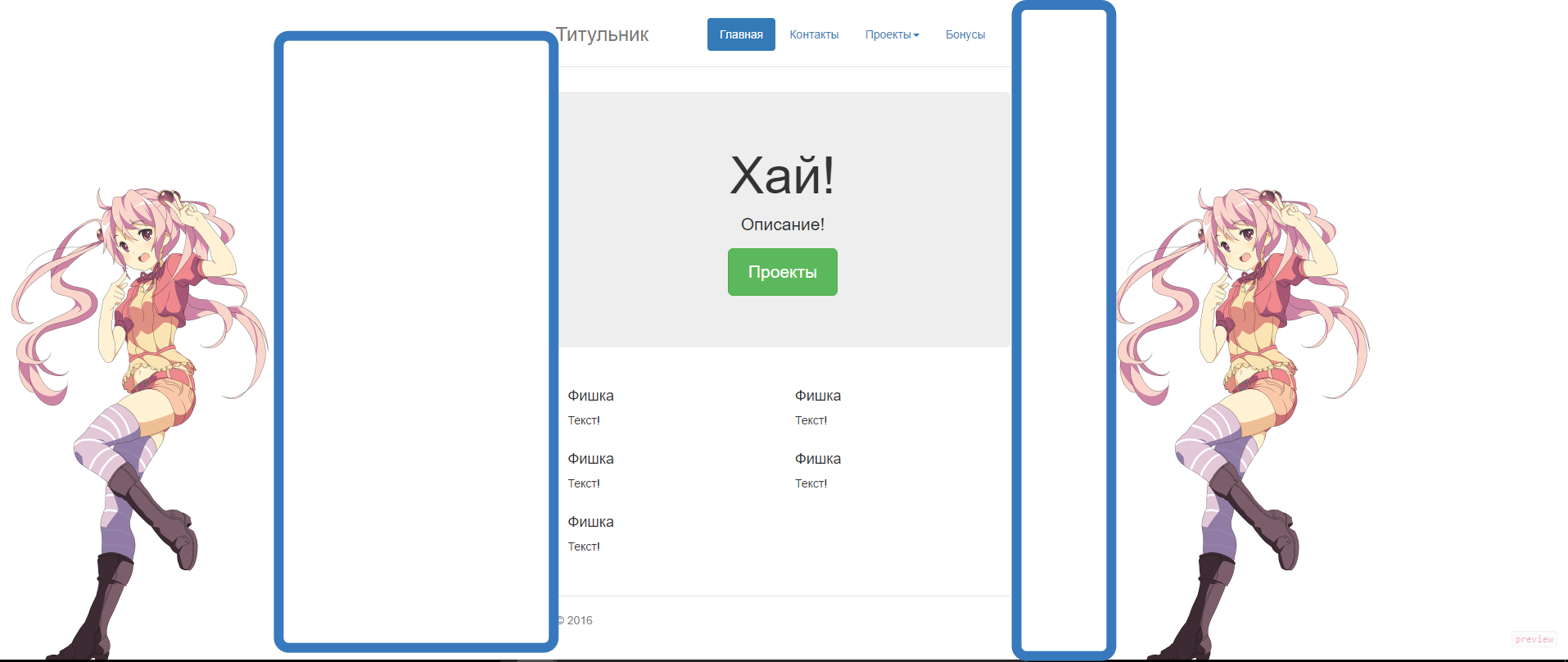
I want to make a website with three columns. In the center is the content, along the edges are fixed pictures that frame this content. (on mobile they turn off and only the center column remains)
I found several solutions on SO and the best I could get here:
www.bootply.com/lbF2piv6x0
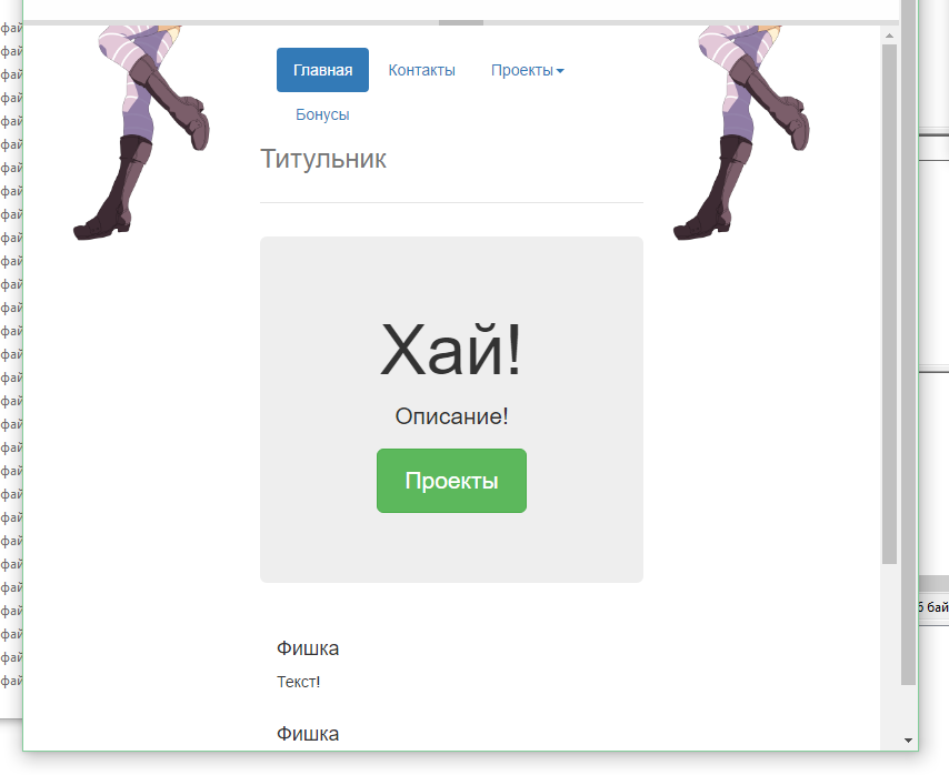
But unfortunately, there are a lot of bugs .-.
Girls stick to anything, not to the central content... 
Moreover, when resizing the browser window, they can get stuck somewhere in particular. 
And the menu itself behaves inappropriately at all ( 
Maybe someone can give a link to a good example or help for a kind word in an article on Habré? :D
Answer the question
In order to leave comments, you need to log in
Didn't find what you were looking for?
Ask your questionAsk a Question
731 491 924 answers to any question